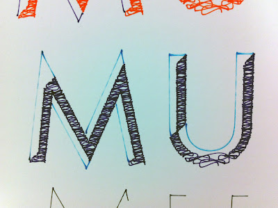
The spacing of the curved lines was too think initially. When I first testing this printing method I thought the spacing was fine and it looked great in biro, however I did not take into account the thickness of my chosen pen. As the nib of the Stabilo pens is thicker, the spacing between curved lines needed to increase as initially all the detail was lost and there was bleed.
Asking fellow students, the concensus was that when black was used it made it look flat. The pink and blue work the best, but with more spacing between curves. Also the text on the bottom of the poster will be in grey. Black will be too heavy and I think if pink or blue is used, it will be overkill. Having it in grey gives the poster more dynamic and another level. It will be clear that this bottom quote/text is secondary and seperate from the main message.


No comments:
Post a Comment