Showing posts with label OUGD101. Show all posts

Monday, 16 November 2009

OUGD101 No News Is Good News (Mailshot)

This has been the best brief yet. I had to create a mailshot that reinforces my message from the previous posters. My resolution had to fit inside the size of an envelope (11.5cm x 16cm) and again we could only use 2 colours plus stock. The mailshot had to be easy enough to reproduce as I would have to create 10 editions for the final submission. I also had to think about an appropriate mailing list for the 10 editions, one version would have to be sent to college which will determine if the stock used was suitable for a mailshot.

We created some open and closed questions as well as found out some facts and opinions on our chosen message. The open questions seemed like they would engage the audience a bit more and lead onto more interest. I had to think about the what, why, how and who as well and write my own brief from this.

WHAT? The sea covers approximately 71% of the earths surface, yet we have surveyed less than 1% of the ocean floors.
WHY? To make people aware and become more interested. Hopefully this will give the subject more credability.
HOW? Through something that pulls/folds/pops out to reveal so much more... linking to the "what?".
WHO? Aimed at schools (teachers) to maybe teach their class about it so kids can do something about it in the future, promote interest.

I thought about different ways in which my audience could interact with my mailshot to make it more interesting. I looked into something which pops out of the envelope to make the people jump but I didn't think this would really fit with what I was trying to say. As my "what?" includes facts and figures, I wondered if I could do something to represent the 71% and the 1%.

I liked the idea of pulling a line of information out of the envelope and it demonstrating 100% of the ocean... with a small 1% of it that we actually know about. I felt that a horizontal feel was better for my subject matter as then I could show more sea floor. I tried to stick with the same style and design I used in my final posters to continue the theme.

I thought about the process of making this and it seemed quite simple. It was similar to the net of the original envelope with some sides to make it thicker so it could hold the inner line of "sea". I originally experimented with tracing paper and soon realised this wouldn't be appropriate as I could only use one stock and tracing paper would easily rip in the post and would also be transparent. I tested my idea on card and it seemed to work just aswell.

Designing was quite simple once I had decided upon the net as I already had a starting point (my posters) and from my research I had background information and knew which stock I would use. I had also been down to the digital print room and discovered that I would have to make some adjustments, such as shortening the inner line of "sea" due to cost and was that I was unable to print double sided on my selected stock.

I decided to use an open ended question to create more interest. "How much do we know about the ocean floor?" Doesn't really communicate that much but when teamed with the inner "sea" I thought it would create quite a powerful statement.

When I showed my ideas in a group crit, the feedback I received was pretty positive (much better than the poster!). A few suggestions were made, one of which about the information inside the envelope. I had thought about putting some text informing what we can do about the fact we know so little about the ocean floors. I had done some extra research and found out some interesting facts, such as it took over 70 years to find Titanic. In the crit, someone suggested that my target audience may not relate to this fact as it is not in a childs lifetime. I began to think more about what kids would find interesting. For my final design I used 3 facts and 2 statements. My facts were about dinosaurs, Titanic and the sunken city of Pavlopetri. All of these facts related to my subject.

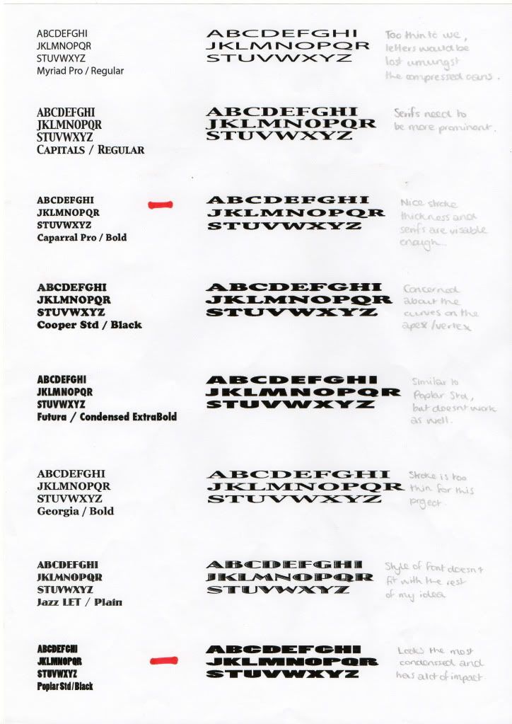
I created my design in Illustrator to create the same feeling as my poster and for them to be consistent. I also used the same colours. Above are the files I used, when I printed them I got rid of the fold lines. I used the font Gill Sans Ultra Bold for the main headings. I felt that this worked really well with the style of illustration and doesn't argue with the message or is too overpowering. I wanted the text and image to work alongside each other and feel each needs the other in this mailshot which I am fine with, I don't think it would have worked with just text or just image. For the informative text I used Gill Sans to keep the theme and same font family.

The images below show how I produced the final resolution. I didn't encounter any problems whilst producing my 10 mailshots so I was very pleased! I just had to cut out the inner and outer nets and stick together.

Here is my mailshot in action...

Thursday, 5 November 2009

OUGD101 No News Is Good News (Poster)


This week long brief was to produce 3 posters communicating a fact from our previous article. We can only use 2 colours plus stock and the format was 2:1. The first poster was to be purely image, the second pure text and the third a mixture of both.

MONDAY 02.11.09
We had a tricky task to do before we knew what the brief was... I had to write down 10 adjectives and 10 verbs, then also draw 10 objects and 10 symbols which related to my article. It was really difficult! I am poor at english/words and poor at drawing!


I then had about an hour to come up with some designs for my poster, using the stuff from the previous task to help. This is when I changed my fact as it was previously "Pavlopetri is the oldest sunken city". I found this translated badly onto a poster format and so changed it to "Less than 1% of the worlds oceans floor have ever been surveyed". I find this quite an alarming and shocking fact, this is also a direct quote from my article. I quite like my initial ideas but they definitely need some development.

WEDNESDAY 04.11.09
Over Monday and Tuesday evening I had begun to design my poster. My first dilemma was how would I create them, as I am rubbish at drawing and (thus I don't enjoy it) and I couldn't take any photographs for this as my fact was about the deep sea... Problem - I don't have an underwater camera and Leeds has no deep sea. I decided to use Illustrator as I could draw simple pictures and make them have a cartoon feel to them, which might work quite well with limited colour. Also my posters would be made of vectors and therefore could be enlarged, shrunk without any loss of quality. The colours I decided to use are black and a nice sea blue, my stock would be white. The blue would represent the sea and be used as a visual aid to show the contrast between land and sea in the image poster.

These three posters inspired my designs (Happy Workforce by Nishant Choksi, Hidden Depths of Racism by Frazer Hudson and Two States by Dettmer Otto).

I sketched out a firmer idea and also some potential characters for my posters. They look quite childish and so when I drew them on Illustrator I made some tweaks to the fish and only used that one, so it didn't look like an advertisement for kids.

THURSDAY 05.11.09
In this morning studio time I tried to finalise my designs as much as possible as I am booked to print at 10am Friday morning. I thought more about frame this morning and how things would work best depending on the positioning, I though back to the Visual Language Classes we had with Amber and thought about how I could present "small". I decided to try and make the >1% (less than one percent) a large part of my type design and decided to make it exceed to frame to hopefully suggest that everything else was smaller than it. On the image and type mixed poster this would also help make my small fish look even smaller! It also looks quite overpowering which is cool as it really pushes the message forward to the audience I think.

=======================
FURTHER DEVELOPMENT

After the final crit for this piece I realised I ad made some mistakes and a few ammendments needed to be made for these posters to work. For one, I had used the wrong symbol for "less than" and some others didn't understand what I was trying to communicate.

Here are my final posters...

Saturday, 31 October 2009

OUGD101 No News Is Good News (Research)

This one week brief was all about research. I had to select a newspaper article from Saturday 17th October 09 and research the story. It was suggested that we choose an article which interested us and that we would be able to investigate further. The tone of voice was important and most newspaper articles are serious... the research had to be related in tone as well as subject to the article context.

The article I choose was titled "Lost city that may have inspired Atlantis myth gives up secrets".

I found this article really interesting because it mixes science with myth. I began by researching more into the Pavlopetri story. Then I focused on researching into Atlantis, bottom trawling ruining sea beds and the bermuda triangle. I choose these subjects as they are all related to my article and I find each of them quite interesting.

Wednesday, 7 October 2009

OUGD101 Alphabet Soup "Ross Allman"

This brief is similar to the Summer Brief, although I must design a typeface for another person on the Graphic Design course. This must be a manipulated existing typeface, which gives me somewhere to start from. From the Randomiser, I was paired with Ross Allman.

MONDAY 05.10.09
We asked each other questions such as our earliest memories, our most treasured possessions and what super power we would have. From this session I found out that he moved to Kuwait when he was young and that is is most loved place. Also he loves gaming and game design. He describes himself as loud, boisterous and a leader. His most treasured possession is a Lamb teddy called Lamby that his Mum got given on the Maternity ward when he was born. Also he would bring back Keith Haring if he could. The person he most admires is Saul Bass. Ross likes...

I also asked Ross what his favourite typeface was. I thought this would make my font more personal if it was based around something he likes. He suggested:
  • ITC Avant Garde Gothic Book
  • Base 02
  • Arial Black
  • Century Gothic
  • Lick Spittle
I sketched out an idea I had involving the Kuwait Towers and the style of Keith Haring. I though it might be cool to use the Kuwait colours aswell when I produce this.

I think I will try and decide more upon a design first and then choose one of the above to manipulate based on and ideas I have.

WEDNESDAY 07.10.09
Today, I realised I was going down the wrong path with my idea. I was basing my designs on what Ross likes... not his personality/characteristics. I went back to the drawing-board and asked Ross to describe himself, I also asked a few mates around him how they would describe him and came up with loud, angry, boisterous, nerdy, worrier, moody, bear-like, sensitive, sarcastic, leader and humorous.


When I got home, I thought about what typeface I could use as my base. From the ones Ross suggested previously, I think Arial Black would work quite well as it is quite simple yet bold. I think this would be good to help me portray my partners character. I worked out what size I would need my original typeface to be to fit onto the A1 sheet (250points), printed them out and began to trace over them... manipulating as I went. I hoped to get a different idea for each letterform and then decide upon the best route.

Currently I like the designs I have done for G and H. I simply traced around the outside of the letterforms and only did small lines for the counters. I was attempting to make the letterforms appear bold and loud. I think with some colour to emphasise this, it could be a good choice to develop further.

FRIDAY 09.10.09
Over Thursday and Friday I developed my typeface further... thinking how I could make my design communicate better. The four words I had picked to use as a base were loud, boisterous, angry and leader. I thought the best way to represent all these was through a shouting mouth on the letterforms. I downloaded some pictures from Flickr and began tracing around the mouths. I then made the Arial Black letterforms 3D in Illustrator as I thought this would add to the feel of boisterous if they had more of a presence on the page.

In Illustrator I placed the outlined mouths over the 3D letterforms where I thought they would have the most impact. I printed this out and began to trace sections. I used the basic idea from G and H as before to create a bolder typeface, and used the mouths as an additional communicator. I also made suggestions of noise lines (as if a loud shout) and think this works quite well.

We had a Crit on Friday and I got some good suggestions about using colour. I messed about with different medias and the positioning of the colours on the letters to discover whichI liked and which worked the best.

From this I decided to use 2 colours. One for the face of the letterform, and one for the sides. The teeth and tongue from the mouth would stay white/clear, as with the noise lines.

MONDAY 12.10.09
Today I finalised all my letterforms...


TUESDAY 13.10.09
Tuesday afternoon I decided upon the colours and media I would use. I experimented with gouache paints, marker pens, fineliners and felt-tips. I was looking for brightness to represent loud. I decided on felt-tip pens outlined with a black fineliner.

WEDNESDAY 14.10.09
Today I started drawing out my typeface on A1 tracing paper which I bought home from the College on Tuesday. I stuck together 8 sheets of A4 to create a white background for my tracing paper, then I sectioned it out so each letterform had the same spacing and also gave my piece a border so if I have time I can add another element to my piece. I placed my letterforms on the white base and laid over the tracing paper. I used masking tape to secure everything in place, this hopefully shouldn't rip any of the paper!

FRIDAY 16.10.09
We had a Crit with Fred and Amber today and it was so intense. The contributions that were made were really useful as there was so much constructive critisisms. I am going to work on my typeface some more over the weekend and make a few alterations which I will show the group on Monday.

Monday, 28 September 2009

OUGD101 Alphabet Soup "Compress"

Image is my comfort zone. This 1 week individual project is based on type. My weakness at present! I must create a set, series or sequence of 10 letterforms which explore and communicate the word "Compress" which I chose out of the "Randomizer". The brief states that I should focus on the manipulation of existing letterforms.

MONDAY 28.09.09
I am really excited about this brief as I can really push myself and use my own ideas. I started by jotting down what I immediately thought of when "Compress" was suggested to me. A metal crusher came to my head to start with, as well as something being squeezed to fit into a smaller space. When I got home I looked through the Dictionary and Thesaurus for more ideas and then began to sketch out some preliminary ideas.


Currently, I am keen on the concept of numerous crushed cans (representing the compression) making the letter... Through development of this idea and remembering the "Type and Form - An Introduction to Type" talk with Fred this morning, I wonder if I could use this idea but use the cans to show the negative space/counters. I also like the thought of using arrows to demonstrate the compression. This might fit the brief more comfortably as it wouldn't be so dependent on an image/photograph to represent the "Randomizer" word... I could make the arrows in the same style as my manipulated letterforms, thus possibly making them seem part of the typeface.

WEDENSDAY 01.10.09
Today I decided upon the can idea and compressed some to develop which way of compressing would be the most effective. I think it would be better to compress the cans from the top opening down to the base, instead of sideways. This way it creates more detail and I can layer them showing the side (as if they are stacked).


I also started looking into which typeface I could manipulate to create a "Compressed" effect. I thought about what are the characteristics of the word "Compress". I also thought about whether upper/lowercase would be most appropriate. Capitols seem to have more of an impact and appear more powerful... However if something is being compressed then that is the weaker matter, so maybe lowercase would be a better representation.

I sifted through Font Book and selected typefaces which I thought would work well compressed.


I selected Caparral Pro / Bold and Poplar Std / Black as the ones which worked best when manipulated in Illustrator. Some of the fonts I chose were too thin or had very small serifs which I believed would be difficult to re-produce with beer cans. I decided to use Poplar Std / Black for my final design as It looked the most condensed and had a lot of impact.

Printing media was also on my mind and I began to think about what would be the most effective media to portray "Compress". I thought about crushing a piece of paper in my hands and it having a really organic look. I experimented with plain paper and newspaper. I like the feel and overall look of using the newspaper, however I am a bit concerned about how the print would appear on the media as my image will be quite detailed with lots of compressed cans. I will experiment with this more on Friday once all my letters have been finalised.

THURSDAY 02.10.09
Today I figured out exactly what to do for each letterform and how I would go about it. I photographed a can from the side after compressing it and then used the Path tool in Photoshop to get rid of any background. These images were then layered up in the negative space created from the letterform.


Landscape suited my word better so that the letterform (or negative space) can still have alot of the space on my A6 sheet. I have decided upon the 10 letters I will use for my piece. They will spell out the word "Compressed" to tie in with my chosen "Randomiser" word. I will use different cans for each letterform.

FRIDAY 03.10.09
On Thursday evening I managed to photograph more cans and created most of my letters. On Friday morning I was finishing these and printing. I decided to print on bog standard paper and crush the prints in my hand, to give a compressed effect.


ILLUSTRATOR
I also had an Illustrator Brief on this idea where I had to create 26 variation of one of my letterforms created. I had a workshop in Illustrator (which I didn't enjoy as I already knew how to use Illustrator). I'm sure the workshop was useful for most people but I just don;t think I needed to attend and could have spent my time more productively. However, I did complete the task. We could only use one colour and we were mainly using the pen tool to draw around our letterforms and edit them to create variations.