| The Brief Select three words from the randomiser. Produce a minimum of 4 five second animated sequence that explore the visual communication of these three words through the use ofletterform only. | Background Software will not save a bad idea. An application of fundamental design principles, appropriate research and development methods and the ability to evaluate the communication of ideas are what you need. Designing for Digital Media is all about organisation. Once you have worked out what you want to do there is a range of systematic approaches that can be used to develop your ideas. Working to restrictions is essential. You will become aware of what you can and can’t do with the time and technology available. Live with it and learn to think creatively around the problems that you encounter. |
| Concept/Proposition Time is precious how do you use it effectively, efficiently and creatively to communicate your ideas. Start with a thousand possibilities and go from there. How does the frame/format inform your investigation. What pace do you associate with your chosen words? What fonts/typefaces/ letterforms are the most appropriate for your words? Keep it simple. Technology creates as many problems as it solves work out what you need to do before you go anywhere near a computer. | Mandatory Requirements The word that you have chosen (or the letters included in those words) must be used in each of your resolution. Your resolution must be produced using Adobe After Effects and be delivered as a QuickTime Movie. You should work to an aspect ratio of 16:9 You can only use BLACK, WHITE + ONE OTHER COLOUR Deliverables 4 x 5 second animated sequences 4 x 12 frame screen grab storyboards in pdf. format. Storyboards, test pieces, design sheets and test storyboards appropriate to your resolution. |
| Studio Brief Deadline THURSDAY 16th DECEMBER - 9.30pm Progress Crit. Tuesday 11th / Wednesday 12th January Submission DeadlineFriday 16th February 2011 – 2pm (all work should be posted to your Design Practice Blog and be labeled with the OUGD202 and Silent Movie) | |

Tuesday, 30 November 2010
Silent Movie briefing

Tuesday, 23 November 2010
OUGD201 evaluation
Through this module I have developed my communication skills through typography. Illustrative typography was an area of design which I wished to explore and I have used these skills to create a memorable image, branded with my logo, to use on promotional posters. The concept of creating illustrative typography using my product (my chosen 'what is good') give it more purpose, meaning and substance.
I have carried out alot more research than in previous modules and through this, have a better understanding of my subject, allowing my communication to be clearer. The majority of my research has been secondary and I should have gained more primary data. I could have definately researched more into printing processes and explained why I chose the limited methods I did.
Since returning from Summer my own capacity to carry out tasks currently has been effected through personal reasons and this has impacted on the quality and quantity of work produced. I am saddened greatly by my response to this module and work I create presently. I cannot identify one thing which is weakest in this module, rather the whole submission is weak.
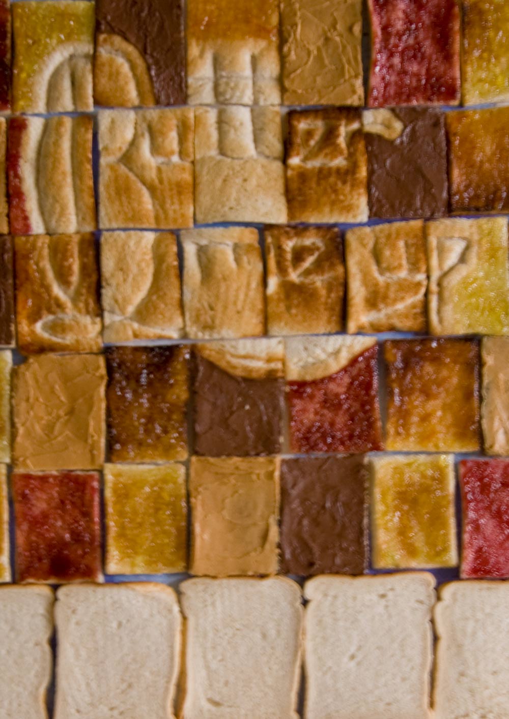
In terms of strengths I can identitfy that I was keen to explore illustrative typography and I undertook the task of creating some myself. I designed and devloped the logo and furthermore applied this to bread. Through the process of toasting, my logo was printed upon the material. In the future, I aim to capitalise on this and carry out more experimentation within typography. Through crits, my idea developed while still keeping to my brief. An example of this is when I decided to package a few slices of bread rather than a whole loaf. This, teamed with audience made much more sense and helped to get the ball rolling.
There are many things I would do differently if I could. I would ideally like to re-sit this module once I am mentally back on track and can unleash my full potential upon it. One key difference I would make to my working style (and can immediately) is to be more active with my research, in terms of making mock-ups and testing ideas rather than thinking about them and giving the internally giving them a thumbs up/down without exploring the physical possibilities.
Monday, 22 November 2010
Printing process
I would be printing the posters using lithography and they should have a barcode on them to fit with CBS regulations, I would also be printing my packaging stickers using lithography. I have chosen this over digital because of the sheer number I would wish to produce.
 Horizontal poster pdf with printer marks.
 Vertical poster pdf with printer marks.

Sunday, 21 November 2010
Promotional final
For my promtional posters which should go inside public transports and on station platforms, I have narrowed my selection down due to time restraints. I will produce 1 horizontal and 1 vertical poster.
 Horizontal promotional poster.


Horizontal promotional poster in context.

Vertical promotional poster.

Vertical promotional poster in context.
Part with a pound
My product is so cheap (£1 for 3 slices of bread, a condiment and some butter) because they are cheap ingredients and also because the printing costs are kept low. I am only printing on a small area on the packaging.
Packaging final
My packaging will only use stickers with a limited amount of ink. If I wanted to decrease the cost further I should have limited how many printing plates that would be needed for litho. I could have made my design 1 or 2 colour.


Tuesday, 16 November 2010
Prioritise...
I need to prioritise what actually NEEDS to be done for the Final Crit tomorrow and what can wait.
For tomorrow...
For tomorrow...
- Promotional copy written and applied to one horizontal and one vertical public transport poster.
- Lables printed and stuck onto jars.
- Mock-up of bread packaging.
- Mock-up of carrier.
- Photoshopped images of promotional material.
- Photographs taken of packaging.
- Create mock-up boards.
For the future...
- Photoshop main image to make more legible and add extra toast to fit dimensions of horizontal promotional posters.
- Develop packaging for bread and carrier, print, make-up and photograph.
- Buy correct shaped jars and attach labels/paint lids.
- Photoshop new promtional images into context.
- Re-create boards.
Monday, 15 November 2010
Copy
All copy must be approved by CBS Outdoor for my public transport promtional posters. I need to work on the copy which will go along side all promtional imagery, It needs to be suitable for my audience and the brand.
IMAGE
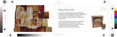
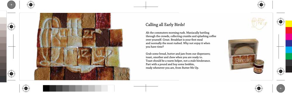
Good morning Early Bird!
We know the mornings are a rush for commuters like you so why not part with a pound and buy some breakie, ready whenever you are, from Butter Me Up.
Who wants to collecting crumbs or splash coffee over yourself while maniacally battling through the crowds?
Not you surely?
Grab some bread, butter and jam from our dispensers; toast, smother and chew when you are ready to. Toast should be a warm helper, not a stale hinderance. Butter me up.
IMAGE
Good morning Early Bird!
We know the mornings are a rush for commuters like you so why not part with a pound and buy some breakie, ready whenever you are, from Butter Me Up.
Who wants to collecting crumbs or splash coffee over yourself while maniacally battling through the crowds?
Not you surely?
Grab some bread, butter and jam from our dispensers; toast, smother and chew when you are ready to. Toast should be a warm helper, not a stale hinderance. Butter me up.
Sunday, 14 November 2010
Promotion - rail panel

From my research I have understood the boundaries for my design of the rail panel. The size of this has to be 420 x 297mm and the display area is 394 x 272mm. I have cropped my image to the appropriate size. Some information will be written over the plain bread section of each design.

Large area of bread.
Small area of bread.
In these cases I think the first example works best as there is enough area of bread so that I can add some additional information here to explain the product.
Promotion - rail 4 sheets

Existing rail 4 sheets in context.

Large area of bread.

Small area of bread.
I think in this case I prefer the second option. It has presence and although this is at such a large size I did not intend on using a large image... however I think it would sit more comfortably in the frame over the first design. There is still room to add a decent amount of promotional and informative text about my range.
Promotion - bus interior

My research has told me that the size of this has to be 203 x 660mm and the display area of this is 173 x 630mm.


I am a little concerned with this one as the typography is very close to the edge and I reckon it will be outside of the display area. My original image from which I am creating all my promotional pieces from has limitations due to the original dimensions. This is an instance where it is creating an issue. I am not sure how to resolve this and I may have to create a border around the image and not have it full bleed so the text is legible and all contained in the display area.

I think (like with tram interior) I will have to Photoshop extra toast and bread into this image to make the dimensions appropriate.
Promotion - tram interior
The size of my promtional tram interior posters must be 195 x 735mm and the display area of this is 183 x 723mm. I need them to be appealling and they can include some text as people will have time to read them.

As with the bus interior the initial dimensions of my physical image are creating problems. I cannot take these images again as they are now in the bin! Also I do not have time to recreate this whole piece again. I will have to either add a border to give me extra space or do a bit of Photoshop 'magic' which I really wanted to avoid in this project.


However much I do not want to manipulate and edit my images I think in this case it has to be done to produce the effect I need. The top 2 examples look shoddy and I cannot think of a good way to incorporate a border. I think a full bleed image will look more professional and fit in with the brand much better than a second thought, easy option of a border.
Promotion - tube car panel
From my research I have understood the boundaries for my design of the tube car panel. The size of this has to be 280 x 609mm and the display area is 240 x 564mm. I have cropped my image to the appropriate size. Some information will be written over the plain bread section of each design.


Smaller typography.

Larger typography.
Unlike with the other landscape promotional posters, this one is not so long meaning that my issue of additional Photoshopping isn't raised. The image is perfectly sized to fit these dimensions. I think in this case I will need to see which one site better with the copy as both of them at this stage look like they would work well equally.
Saturday, 13 November 2010
Condiments packaging - experimenting
I have looked at small jars to package my condiments because plastic looks cheap and the glass has a nicer feel to it. Also with it being clear, the contents can be seen.
These little pots are my favourite as they are cute! Ideally it would be great if I could design and produce my own jars but at this time that is impossible.
 Front view (as the customer would see).
 Lids of jars.
I will create my own label to put around the jars and also have a different coloured lid to go with my brand identity.
I wanted to continue the theme taken from my main image. I have used the same method but have used relating condiments to words.
Instead of using Marmalade and Jam I am using the main ingredient such as Orange and Raspberry. This is for ease and also will make my brand stand out for being simple and different. It helps my customers make a fast choice if they can see clearly what they are getting.
 Printed toast.
 Printed toast with condiment detail.
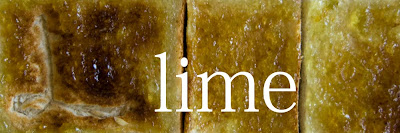
From these prints onto toast I can adapt them for each condiment. Using Lime as a dummy I have looked into different typefaces and need to see which works best alongside the image. As the typography on the toast is hand-drawn, I do not want the suporting text to overpower this. It need to be simple, but also welcoming to the audience.


These little pots are my favourite as they are cute! Ideally it would be great if I could design and produce my own jars but at this time that is impossible.


I will create my own label to put around the jars and also have a different coloured lid to go with my brand identity.
I wanted to continue the theme taken from my main image. I have used the same method but have used relating condiments to words.
Instead of using Marmalade and Jam I am using the main ingredient such as Orange and Raspberry. This is for ease and also will make my brand stand out for being simple and different. It helps my customers make a fast choice if they can see clearly what they are getting.


From these prints onto toast I can adapt them for each condiment. Using Lime as a dummy I have looked into different typefaces and need to see which works best alongside the image. As the typography on the toast is hand-drawn, I do not want the suporting text to overpower this. It need to be simple, but also welcoming to the audience.

L printed toast with lime condiment.

Additional letterforms making up the word Lime in Peach Sundress.

Academy Engraved LET.

Futura Medum Italic.
 Helvetica Neue.
 Mona Lisa Solid.
 Nueva Std Bold Condensed Italic.
 Optima Bold Italic.
 Perpetua Bold Italic.
 Walkway Bold.
 Adobe Fangsong Std.
I think out of my selction, Helvetica Neue and Walkway Bold work the best. I will exeriment with these more to get the best result. The typeface I choose will be used on all other packaging solutions and promtional material.
 Raspberry typography experiment.
 Orange typography experiment.


I think out of my selction, Helvetica Neue and Walkway Bold work the best. I will exeriment with these more to get the best result. The typeface I choose will be used on all other packaging solutions and promtional material.


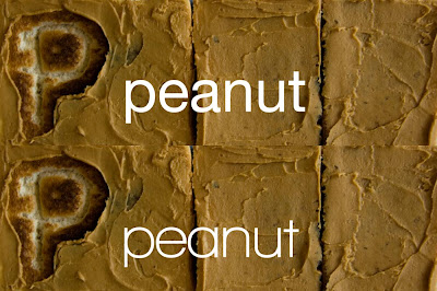
Peanut typography experiment.

Hazelnut typography experiment.
I definatly prefer the examples using Walkway Bold. I think Helvetic looks a bit boring and I need something which has enough interest to keep in line with my range... but not too much to detract from the illustrative type on the toast. Here are my final labels to go onto my jars... I am really happy with them!
 Final packaging jar labels.

Bread packaging - experimenting
I know that I need to use clear packaging for the food as from my research this enables the customer to see what they are buying... as this is being eaten it is really good if you can see how fresh something is.
 Box with click lock.
 Double- walled box.
I really like the double-walled box. It has a more professional feel to it I think and a simple design could be really effective. With this I could incorporate a see-through lid with a plain white bottom.
 Chosen net with see-though lid.
This works quite well... but I am not keen on seeing the joins of the net. I could instead use a see-through panel instead of the whole piece made from acetate. Also... I need an opaque section on the front that I can print my image onto.
IMAGE.
 Lid of net with acetate panel.
I have tried to make a digital mock-up of this design...
 Rough digital version of design.
I think this look rubbish! It doesn't fit in with my image. It loks too busy. I have realised that I think I need to approach this the same as I did the packaging for the condiments and use a new image (just toast with print).
 Bread packaging image.
As like the condiments, I think this works well and also it will really help my products look like a range. I need to incorporate this image into my chosen net. I think as like that jars to hold the condiments, I will use a similar design. To keep up this similarity I think I will revert back to using acetate as the lid. This increases the amount the customer can see. I think I can adapt the way I put the net together so that the joins are not visable from the front, but from the sides.
 Acetate lid with joins hidden on side.
I prefer this over all the others as it fits better with the overall brand. The belly band would be printed with the 'bread' brand as like the condiments (see above).


I really like the double-walled box. It has a more professional feel to it I think and a simple design could be really effective. With this I could incorporate a see-through lid with a plain white bottom.

This works quite well... but I am not keen on seeing the joins of the net. I could instead use a see-through panel instead of the whole piece made from acetate. Also... I need an opaque section on the front that I can print my image onto.
IMAGE.

I have tried to make a digital mock-up of this design...

I think this look rubbish! It doesn't fit in with my image. It loks too busy. I have realised that I think I need to approach this the same as I did the packaging for the condiments and use a new image (just toast with print).

As like the condiments, I think this works well and also it will really help my products look like a range. I need to incorporate this image into my chosen net. I think as like that jars to hold the condiments, I will use a similar design. To keep up this similarity I think I will revert back to using acetate as the lid. This increases the amount the customer can see. I think I can adapt the way I put the net together so that the joins are not visable from the front, but from the sides.

I prefer this over all the others as it fits better with the overall brand. The belly band would be printed with the 'bread' brand as like the condiments (see above).
Subscribe to:
Posts (Atom)