I wanted to experiment with a different font... one which was more robust and bolder so that I could distort it so far by 'stretching' indiviidual points it could look something like this...
IMAGE
Here is what I initially produced using Quad Light, but again when mask points interest they invert and this is so annoying! I like the font though and have another idea to emphasise stretching by using colour also.
I tried using opacity to show how the 'material' would thin as stretched. Again experimenting with the typeface Quad but this time in Ultra. Each letter had to be imported onto a seperate solid layer to create its own mask to avoid the problem of inverting when crossover occured. I may apply this technique to all letterforms in the animation... but just as a demonstration...

Thursday, 30 December 2010
Thursday, 16 December 2010
Stretch idea 1
From the key frame storyboard ideas shown on xxx (link) I have made this quick animation.
Stretch1 from Hazel Gage on Vimeo.
I really need to develop this further. I wish I could make the masks not overlap and also the speed needs looking at. I could also make the word look like it is under pressure and stretched against its will. I could do this by making the word shake or something.
Stretch1 from Hazel Gage on Vimeo.
I really need to develop this further. I wish I could make the masks not overlap and also the speed needs looking at. I could also make the word look like it is under pressure and stretched against its will. I could do this by making the word shake or something.
Tuesday, 14 December 2010
After Effects workshop 3
Image of notes.
Creating text within After Effects
 Type created in AFter Effects.
nveor;anvr
 Transform anchor point.
nuor;eanovpr
 Pan behind tool (y).
gtrstrbf
 More text options.
bfuie;vai
 Source text.
bhueptarioe;a
Source text from Hazel Gage on Vimeo.
hteaheahae
 Animate properties.
nviaer;voe
 Anchor point keeps position.
veabrtbea
 Animate position per character.
gtdbgrbs
 Based on.
btebtrt
Animate position from Hazel Gage on Vimeo.
bvuow;nevipw
Opacity from Hazel Gage on Vimeo.
fyukgu,bi
Scale from Hazel Gage on Vimeo.
Creating text within After Effects

nveor;anvr

nuor;eanovpr

gtrstrbf

bfuie;vai

bhueptarioe;a
Source text from Hazel Gage on Vimeo.
hteaheahae

nviaer;voe

veabrtbea

gtdbgrbs

btebtrt
Animate position from Hazel Gage on Vimeo.
bvuow;nevipw
Opacity from Hazel Gage on Vimeo.
fyukgu,bi
Scale from Hazel Gage on Vimeo.
Friday, 10 December 2010
After Effects workshop 2
Image of notes.
Preparing Assets in Photoshop
 New.
New.
Can select the correct size appropriate for screen by selecting the right preset size. This does not need to be the same size as composition in After Effects... (if you want it smaller than full screen).
 Show guides for action safe and title safe (cmd + ;).
 Title safe and action safe in After Effects.
The title safe and action safe guides will be really helpful in each application so that I can create key frames in the areas of screen that will have most impact for my audience.
 Text created in Photoshop.
By creating the type inside the title safe area, I cropped my image down and made sure the backgraound was transparent.
 Photoshop text imported as footage into After Effects.
With all the type on the same layer on Photoshop, it is hard to edit individual aspects of the word. This has been imported as Footage.
 Layer via cut (cmd + sft + j).
In Photoshop I created all aspects of this word into seperate layers and then imported into After Effects as a Composition.
 Photoshop text imported as composition into After Effects.
By having these letters on seperate layers I could edit each of these individually in After Effects.
Photoshop import on After Effects from Hazel Gage on Vimeo.
 New.
New.
Can also use Illustrator to create assetts to be imported into After effects. I think I would be more suited to using Illustrator for this project as I find it easier to use and I can edit the letters beofre importing. by the size I can select PAL with widescreen. No pixels (square or rectangular) need to be selected as Illustraor doesn't use pixels.
 New Illustrator artboard.
The Illustrator artboard uses the title safe and action safe areas also.
 Text on seperate layers.
By having the letterforms on seperate layers, I can edit them individually in After Effects.
 Pixelated.
Illustrator import on After Effects from Hazel Gage on Vimeo.
Even though Illustrator uses vectors, assetts will still become pixelated if transformed in After Effects. This is because After Effects rasterizes it as it is pixel based. To diminish this, you can use they layer switches.
 Layer switches.
The layer switch (for vector layers; continuously rasterize) which looks like a little sun can be turned on for vector layers and will continuously rasterize that layer, this means it will not pixelate. This will not increase the file size but will increase how long it takes for a RAM preview. I will definately be using Illustrator to create assetts and then use this layer switch to make the animation look more slick.
By importing an assett into After Effects as Composition - Retain Layer Sizes teh anchor point for each layer in in the centre of that specific layer, and not the composition.
Masks
I wanted to stretch the individual serifs of a letterform in After Effects for one of my keyframe storyboard ideas. Mike suggested that I would need to outline my text in Illustrator before I imported it into After Effects. I need to create a new solid layer, the size of the composition and paste the path, from Illustrator onto this. I will now have all my paths from Illustrator and can drag edit them as I would do in Illustrator.
Mask from Illustrator to After Effects from Hazel Gage on Vimeo.
Preparing Assets in Photoshop

Can select the correct size appropriate for screen by selecting the right preset size. This does not need to be the same size as composition in After Effects... (if you want it smaller than full screen).


The title safe and action safe guides will be really helpful in each application so that I can create key frames in the areas of screen that will have most impact for my audience.

By creating the type inside the title safe area, I cropped my image down and made sure the backgraound was transparent.

With all the type on the same layer on Photoshop, it is hard to edit individual aspects of the word. This has been imported as Footage.

In Photoshop I created all aspects of this word into seperate layers and then imported into After Effects as a Composition.

By having these letters on seperate layers I could edit each of these individually in After Effects.
Photoshop import on After Effects from Hazel Gage on Vimeo.
Preparing Assets in Illustrator

Can also use Illustrator to create assetts to be imported into After effects. I think I would be more suited to using Illustrator for this project as I find it easier to use and I can edit the letters beofre importing. by the size I can select PAL with widescreen. No pixels (square or rectangular) need to be selected as Illustraor doesn't use pixels.

The Illustrator artboard uses the title safe and action safe areas also.

By having the letterforms on seperate layers, I can edit them individually in After Effects.

Illustrator import on After Effects from Hazel Gage on Vimeo.
Even though Illustrator uses vectors, assetts will still become pixelated if transformed in After Effects. This is because After Effects rasterizes it as it is pixel based. To diminish this, you can use they layer switches.

The layer switch (for vector layers; continuously rasterize) which looks like a little sun can be turned on for vector layers and will continuously rasterize that layer, this means it will not pixelate. This will not increase the file size but will increase how long it takes for a RAM preview. I will definately be using Illustrator to create assetts and then use this layer switch to make the animation look more slick.
By importing an assett into After Effects as Composition - Retain Layer Sizes teh anchor point for each layer in in the centre of that specific layer, and not the composition.
Masks
I wanted to stretch the individual serifs of a letterform in After Effects for one of my keyframe storyboard ideas. Mike suggested that I would need to outline my text in Illustrator before I imported it into After Effects. I need to create a new solid layer, the size of the composition and paste the path, from Illustrator onto this. I will now have all my paths from Illustrator and can drag edit them as I would do in Illustrator.
Mask from Illustrator to After Effects from Hazel Gage on Vimeo.
Thursday, 9 December 2010
Wednesday, 8 December 2010
Storyboarding workshop 2
IMAGE
In this session I had a limited time to create 9 storyboards, each consisting of 5 keyframes.

Crunch.
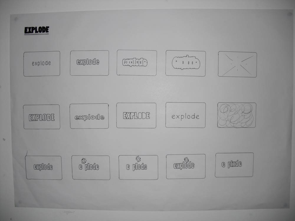
Explode.

Stretch.
This workshop really helped me understand the importance of storyboarding and screen grabbing. It is a good way of developing ideas before opening After Effects. I liked storyboarding and need to get to grips with working faster and unleashing my ideas. I can think outside the frame which it something I would really like to build on in this module.
After Effects workshop 1
Image with notes
 After Effects workspace.
Panels
 Solid layer.
Now have a new 'solids' folder in the project panel and have a representation of this new solid layer over the 5 second duration in the timeline panel. Still images automatically last for the whole animation duration. I can move this 'solid layer' around in the frame (spacially), and also adjust the time length of it in the timeline panel (temporarily).
 Simple animation.
By repeating layers and adding new ones and also altering them spacially and temporarily I can create a simple animation. By using the RAM preview button in the preview panel, you can watch the animation at real time (cannot be 100% certain it is playing in real time just by using the play button).
 Work area bar.
Work area bar
By using the work area bar we can select a small section of the animation to demonstrate.
Untitled from Hazel Gage on Vimeo.
Keyframes
 Layer properties.

Layer Properties
By using the layer properties you can add transitions and effects like position, anchor, rotation, scale and opacity.
Untitled from Hazel Gage on Vimeo.
You can also select more properties and layers to edit at once by using the keyboard shortcuts to create this...
Untitled from Hazel Gage on Vimeo.

Panels
- Project Panel is where you store all the assests (library if assets) to be used in your animation.
- Timeline Panel is the area where you arrange assets of animation. This decides when something happens.
- Composition Panel allows us to see our animation.
Spacial and temporary
Spacially is the movement (where) and temporarily is the time aspect (when).
 Presets.
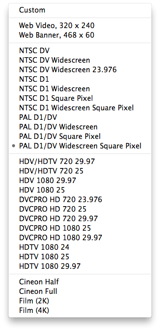
 Composition settings (cmd + n)
Pixel aspect ratio
Must use PAL at 25 frames a second as this is the UK standard and Photoshop uses square (still images) video uses rectangular pixels (moving images) and for this project the format is 16:9 which is widescreen.
 New solid layer (cmd + y)

Pixel aspect ratio
Must use PAL at 25 frames a second as this is the UK standard and Photoshop uses square (still images) video uses rectangular pixels (moving images) and for this project the format is 16:9 which is widescreen.


Now have a new 'solids' folder in the project panel and have a representation of this new solid layer over the 5 second duration in the timeline panel. Still images automatically last for the whole animation duration. I can move this 'solid layer' around in the frame (spacially), and also adjust the time length of it in the timeline panel (temporarily).

By repeating layers and adding new ones and also altering them spacially and temporarily I can create a simple animation. By using the RAM preview button in the preview panel, you can watch the animation at real time (cannot be 100% certain it is playing in real time just by using the play button).

Work area bar
By using the work area bar we can select a small section of the animation to demonstrate.
Untitled from Hazel Gage on Vimeo.
Keyframes


Layer Properties
By using the layer properties you can add transitions and effects like position, anchor, rotation, scale and opacity.
Untitled from Hazel Gage on Vimeo.
You can also select more properties and layers to edit at once by using the keyboard shortcuts to create this...
Untitled from Hazel Gage on Vimeo.
Tuesday, 7 December 2010
Flipbook workshop
Image of notes
This was my first attempt at creating a flipbook. I decided to try out 2 ideas but only one really worked. I can see how a flipbook is a quick sketching way to see how an idea might work.
This was a more refined version of a more eleborate idea. It was supposed to show 'stretch' but I created some lines wrong in the first few frames so I had to change my idea. I think it still works well and shows me how effective flipbooks can be in demonstrating an idea. I have found that for me, it is easier to work backwards and draw the last frame first. This way I can used the next frame as a a trace.
Monday, 6 December 2010
Issuu and Vimeo
I am signed up to both Issuu and Vimeo now so that I can upload PDFs and after effects videos that I make onto my blog.
 Issuu account.
 Vimeo account.


Wednesday, 1 December 2010

Tuesday, 30 November 2010
Silent Movie briefing
| The Brief Select three words from the randomiser. Produce a minimum of 4 five second animated sequence that explore the visual communication of these three words through the use ofletterform only. | Background Software will not save a bad idea. An application of fundamental design principles, appropriate research and development methods and the ability to evaluate the communication of ideas are what you need. Designing for Digital Media is all about organisation. Once you have worked out what you want to do there is a range of systematic approaches that can be used to develop your ideas. Working to restrictions is essential. You will become aware of what you can and can’t do with the time and technology available. Live with it and learn to think creatively around the problems that you encounter. |
| Concept/Proposition Time is precious how do you use it effectively, efficiently and creatively to communicate your ideas. Start with a thousand possibilities and go from there. How does the frame/format inform your investigation. What pace do you associate with your chosen words? What fonts/typefaces/ letterforms are the most appropriate for your words? Keep it simple. Technology creates as many problems as it solves work out what you need to do before you go anywhere near a computer. | Mandatory Requirements The word that you have chosen (or the letters included in those words) must be used in each of your resolution. Your resolution must be produced using Adobe After Effects and be delivered as a QuickTime Movie. You should work to an aspect ratio of 16:9 You can only use BLACK, WHITE + ONE OTHER COLOUR Deliverables 4 x 5 second animated sequences 4 x 12 frame screen grab storyboards in pdf. format. Storyboards, test pieces, design sheets and test storyboards appropriate to your resolution. |
| Studio Brief Deadline THURSDAY 16th DECEMBER - 9.30pm Progress Crit. Tuesday 11th / Wednesday 12th January Submission DeadlineFriday 16th February 2011 – 2pm (all work should be posted to your Design Practice Blog and be labeled with the OUGD202 and Silent Movie) | |

Tuesday, 23 November 2010
OUGD201 evaluation
Through this module I have developed my communication skills through typography. Illustrative typography was an area of design which I wished to explore and I have used these skills to create a memorable image, branded with my logo, to use on promotional posters. The concept of creating illustrative typography using my product (my chosen 'what is good') give it more purpose, meaning and substance.
I have carried out alot more research than in previous modules and through this, have a better understanding of my subject, allowing my communication to be clearer. The majority of my research has been secondary and I should have gained more primary data. I could have definately researched more into printing processes and explained why I chose the limited methods I did.
Since returning from Summer my own capacity to carry out tasks currently has been effected through personal reasons and this has impacted on the quality and quantity of work produced. I am saddened greatly by my response to this module and work I create presently. I cannot identify one thing which is weakest in this module, rather the whole submission is weak.
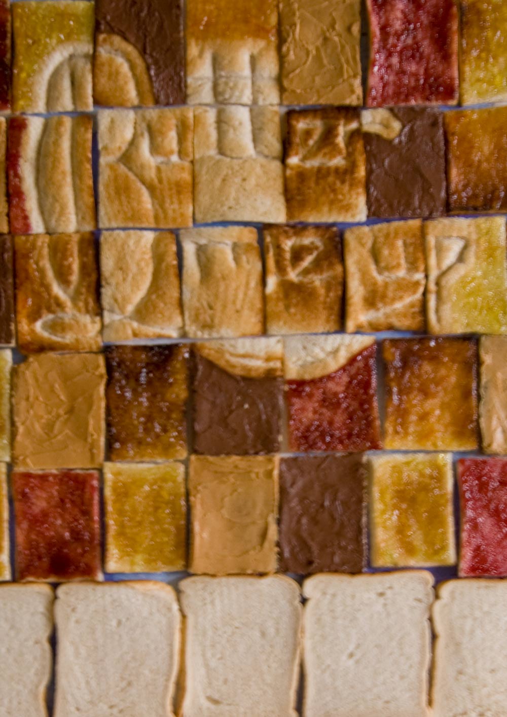
In terms of strengths I can identitfy that I was keen to explore illustrative typography and I undertook the task of creating some myself. I designed and devloped the logo and furthermore applied this to bread. Through the process of toasting, my logo was printed upon the material. In the future, I aim to capitalise on this and carry out more experimentation within typography. Through crits, my idea developed while still keeping to my brief. An example of this is when I decided to package a few slices of bread rather than a whole loaf. This, teamed with audience made much more sense and helped to get the ball rolling.
There are many things I would do differently if I could. I would ideally like to re-sit this module once I am mentally back on track and can unleash my full potential upon it. One key difference I would make to my working style (and can immediately) is to be more active with my research, in terms of making mock-ups and testing ideas rather than thinking about them and giving the internally giving them a thumbs up/down without exploring the physical possibilities.
Monday, 22 November 2010
Printing process
I would be printing the posters using lithography and they should have a barcode on them to fit with CBS regulations, I would also be printing my packaging stickers using lithography. I have chosen this over digital because of the sheer number I would wish to produce.
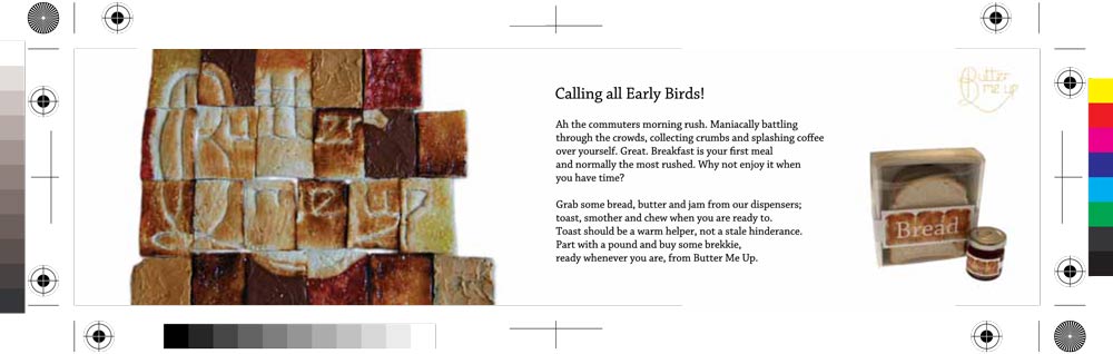
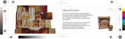 Horizontal poster pdf with printer marks.
 Vertical poster pdf with printer marks.

Sunday, 21 November 2010
Promotional final
For my promtional posters which should go inside public transports and on station platforms, I have narrowed my selection down due to time restraints. I will produce 1 horizontal and 1 vertical poster.
 Horizontal promotional poster.


Horizontal promotional poster in context.

Vertical promotional poster.

Vertical promotional poster in context.
Part with a pound
My product is so cheap (£1 for 3 slices of bread, a condiment and some butter) because they are cheap ingredients and also because the printing costs are kept low. I am only printing on a small area on the packaging.
Packaging final
My packaging will only use stickers with a limited amount of ink. If I wanted to decrease the cost further I should have limited how many printing plates that would be needed for litho. I could have made my design 1 or 2 colour.


Tuesday, 16 November 2010
Prioritise...
I need to prioritise what actually NEEDS to be done for the Final Crit tomorrow and what can wait.
For tomorrow...
For tomorrow...
- Promotional copy written and applied to one horizontal and one vertical public transport poster.
- Lables printed and stuck onto jars.
- Mock-up of bread packaging.
- Mock-up of carrier.
- Photoshopped images of promotional material.
- Photographs taken of packaging.
- Create mock-up boards.
For the future...
- Photoshop main image to make more legible and add extra toast to fit dimensions of horizontal promotional posters.
- Develop packaging for bread and carrier, print, make-up and photograph.
- Buy correct shaped jars and attach labels/paint lids.
- Photoshop new promtional images into context.
- Re-create boards.
Monday, 15 November 2010
Copy
All copy must be approved by CBS Outdoor for my public transport promtional posters. I need to work on the copy which will go along side all promtional imagery, It needs to be suitable for my audience and the brand.
IMAGE
Good morning Early Bird!
We know the mornings are a rush for commuters like you so why not part with a pound and buy some breakie, ready whenever you are, from Butter Me Up.
Who wants to collecting crumbs or splash coffee over yourself while maniacally battling through the crowds?
Not you surely?
Grab some bread, butter and jam from our dispensers; toast, smother and chew when you are ready to. Toast should be a warm helper, not a stale hinderance. Butter me up.
Sunday, 14 November 2010
Promotion - rail panel

From my research I have understood the boundaries for my design of the rail panel. The size of this has to be 420 x 297mm and the display area is 394 x 272mm. I have cropped my image to the appropriate size. Some information will be written over the plain bread section of each design.

Large area of bread.
Small area of bread.
In these cases I think the first example works best as there is enough area of bread so that I can add some additional information here to explain the product.
Promotion - rail 4 sheets

Existing rail 4 sheets in context.

Large area of bread.

Small area of bread.
I think in this case I prefer the second option. It has presence and although this is at such a large size I did not intend on using a large image... however I think it would sit more comfortably in the frame over the first design. There is still room to add a decent amount of promotional and informative text about my range.
Subscribe to:
Comments (Atom)