Thursday 31 March 2011

Product - range - distribution

Got this brief today... I'm pretty excited about starting to make work that I want/need to develop in the area I am moving towards. I found when I made my PDF sampler that I wasn't happy at all with professionals seeing my work. I know I am a student but I really think I should have work I am more proud of by now. Hopefully from now on I will be creating work more specific to the areas I like and therefore I should be overall more happy with the stuff I produce.

Firstly I identitfied my areas of interest. Now I can see what are the drivers in my design practice.


Subject/Content

  1. Design
  2. Photography
  3. Data (information)
  4. Creative content
  5. Type and image
Media/Process
  1. Handheld
  2. Print
  3. Paper
  4. Handdrawn but digitised
  5. Type
Product/Outcome
  1. Editorial
  2. Mailouts
  3. Limited posters
Audience/Context
  1. Designers
  2. Information
  3. Not corporate
  4. Adults
Specialisms/Skills
  1. Layout
  2. Type
  3. Quality print

Wednesday 30 March 2011

Web workshop 1

Morning session...
Really useful workshop. I don't want to be a web designer or design for web, but I really want to design my own website. I think it is a bit low when designers don't design their own identity... makes me question their ability.


Apple UK


The Apple website is very clinical and boring, corporate and structured due to the limited colour, alot of information and branding throughout. It doesn't have personality which shines and looks clean, but messy with so much to look at.

Sumit Paul


Intreguing by having a name as the first thing you see... however this looks rather pretentious... also lacks personality... and the colour choices are awful.

East Village Eatery


Could look expensive but I do prefer this as it has personality and use of colour demonstrates branding, but not corporate.

Stephen Caver


I like the colours and the that type has been used... but it is overpowering and is hard to read because the flow is disrupted by weight. I don't understand why the navigation is repeated at the bottom aswell as at the top... There are little bits I like about this website, but there is alot which annoys me.

Monsieur Cabinet


This just looks like a template to me and I HATE the background colour. The navigation is also hard to read with alot of options.

Oliver James Gosling


Looks corporate... almost government. Also why does it look like paper when he is a web developer. Doesn't stand out and says he is a serious designer. No fun involved with this guy apparently.

Olly Moss


Use of Indexhibit is now really popular and in this case, intregues to look further into the design... I guess you go into it with fresh eyes and are not tainted or have pre-conseptions. This would only really work if you work was good! I like it... just I am not keen on the branding... it doesn't look any different at the first page.

Evangel Cathedral


Worst website ever. Everything moves. Tilled background with a gradient... nuff said.

Afternoon session...
Bassically went over the same stuff as in the morning but in a more organisational view in terms of linking pages etc. It was a bit complicated as it is hard to tell how things link back and what is visable on each page. I think I would find it easier (as we have a limited number of pages) to simply sketch or write out what would be on each page. Obv if there are many many pages, I can see how this flow chart way of working would be valuable. Basically I want the navigation to be shown on all pages and as few pages as possible. I need to put up on DC some websites which I like.
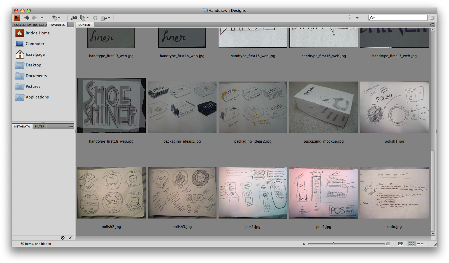
IMAGE OF NOTEBOOK


Friday 25 March 2011

YCN website crash!

Since 3pm the YCN submission has been broken... They posted on their website that they would extend the deadline accordingly. Ailsa also sent YCN an email and the response we recieved was that we should be able to submit from Tuesday onwards.


Submission boards

IMAGES OF THE SUBMISSION BOARDS

Thursday 24 March 2011

POS

I created the POS on Illustrator as thought this would be easier and still communicate my ideas effectivily.

IMAGE OF FINAL POS

Photographs of final products - edited

Ailsa edited the photographs I took...

IMAGES OF FINAL PHOTOS

Sooo many files!

In my secondary research folder I have 161 items... bit excessive?! To show all the work that I have for this project I thought it would be good to show the entent of how much research and time has been put in by both me and Ailsa... Here are the files on my computer so far... I have tried to keep my files organised so I don't get confused and it has helped when seding files between the collaboration. I just need to work on my naming conventions now as I have loads of files, alot of them are old designs and are not needed anymore.

Crits


Digital Designs


Handdrawn Designs


Research - Primary


Research - Secondary


Photographs of final products - unedited

From our feedback in the final presentation, we decided to take better photos. We were going to do this anyway but we have more direction now. We thought about a grey background, but the wood seems more interesting and works well against the paper stock. It would have been nice to use a darker varnished wood, but we may be able to photoshop these.

I decided to take these photos in natural light as this will always give great results over tungsten lighting. However one downside is the shadows. I don't mid these and think they make the whole thing look more real and less staged, but I guess that is down to personal taste.

Ailsa is going to Photoshop these and hopefully get rid of the red fold lines and crop down to the wood background so there is no distracting background present.

PRE-EDITED IMAGES

Bag mock-ups

I know its really late and I really should have done this earlier on in the project, but I mocked-up my bag design... I think it works quite well but there are some superficial changes which need to be made such as folding the net instead of cutting it in some places and creating a handle for customers to actually carry this bag!

IMAGES OF MOCKUPS

Tuesday 22 March 2011

Tin mock-ups

I mocked up the tin and tried out putting the fingerprint over the top in real shoe-polish. However this looked awful! I will have to take this out of the final design as it just adds mess and doesn't communicate aswell as I initially thought and hoped it would!

IMAGES OF TIN MOCK-UP... PRINT IN B&W AND MOCK-UP

Final Presentation

Our boards were missing quite a bit of information but we got some good feedback and constructive changes we can make to the design and content of the boards.

IMAGES OF BOARDS AND FEEDBACK INCLUDING OUR RESPONSES.

Monday 21 March 2011

Printing / crafting

In our contract and from our revised roles last week we jointly decided that I should print and Ailsa should craft. We need everything done by tomorrow evening as we are booked in from 7. I think it might be a bit tight but hopefully we can get everything done.

Possible board design...

The boards were tricky to design... We both have content to put into them but as time was an issue I thought I would bash them out from home and sne dto Ailsa for review. This action worked quite well but we are relying on the feedback from tomorrows session to improve these boards. Even though I created the original design, the feedback from Ailsa was vital in improving the design and moving it forward more effectively.

I wanted to try something a bit different... but this just looks awful and not in-keeping with our theme or project at all... apart from the colours and use of circle.

Rejected for good reasons!


Instead we simplified it down and I created this version which simply sits along the bottom of an A3 board. There would be a more consistent area for photographs and uses the typefaces we chose for the project. 

Bit too bland...


So... Ailsa suggested adding colour and making the page numbering look more like the polish tin. Comments too on board... (ha I made a joke!) and make these boards (photographic content to be added).


Tin photoshopped...

I am really pleased with this! It will be ok for the presentation on Tuesday but a few things need to be added such as the Ted Baker logo and thumb prints. These all have a place free on this design so it will not mess up the design or be an after thought.


POS designs

For the point of sale I don't want it to be too overpowering of the store but it needs to grab peoples attention and relate to the packaging and other designs we have done.