Thursday 27 January 2011

Type 3

Here is a leaflet made for an anti BNP meeting. I missed this lesson, but completed the task outside of the lesson. As this is for aactivist organisation, I assume they will not be able to pay alot of money, therefore I will be using limited colours to lower the print cost. 


Wednesday 26 January 2011

Progress Crit 2

Top 10 Worst Fonts (according to 'Just My Type' by Simon Garfield.


A documentary style programme informing viewers of the worst fonts and WHY.

A factual, but not serious and dull approach, to communication of content.

Channel most appropriate is More4/Channel 4/BBC2/BBC4 - need some guidance

All digital or some aspects of hand-drawn?


Transition from one type to another in this style but mixing with digital assests...


Handrawn images bought to life... not much After Effects but this style of illustration could be the background of people destroying the typeface.

Tuesday 25 January 2011

After Effects workshop 6

Chat with Lorraine

I asked Lorrain for a bit of her feedback on my change of direction and she thought I had made the right decision. She also helped me realise the endless possibilties of animating my sequences. I have blogged loads from what I have found and aim to experiement with lots over the next few days and decide upon a more specific direction to take after the crit.

In terms of audience, she suggested that it is not restricted alot by age or gender, as it is about interest. People who will be interested in viewing my programme will have at least a basic knowledge of computers and will know some of these typefaces by the look of them. Graphic Designers and students will be interested, but also people who gather knowledge. I need to find an appropriate TV channel to air my programme, possibly BBC 4 or More4 as these well known channels broadcast documentarys and more cultural shows.

Saturday 22 January 2011

Top 10 worst fonts in the world

Right, so after my crit I have realised that my idea has turned precious. By this I mean that I have made it a design which I wish to do, no matter if it will communicate most effectively or not. Due to this revelation, I have changed my idea for the Top 10 and will start over again. I believe this is the best idea as I don't believe I will be completely happy with my idea now unless I do it my way.. which is completely wrong!

My new top 10 comes from 'Just My Type' by Simon Garfield. I believe actually having a 'top' set in stone with clear reasoning will guide me as to how I should present to the appropriate audience. There is a list of the worst fonts (designed by professionals) and here is a summary of the 8 presented in the book...
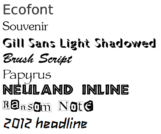
1. 2012 Headline
Good - we got the 2012 Olympics
Bad - we chose shit designs


How did we balls this up so badly. Disgraceful. I have not found a single person that likes our branding of therc 2012 Olympics. Why was this chosen, seriously (check out my Olympics post on DC to find my entire rant...). Alice Rawsthrorn states "it looks increasingly like the graphic equalizer of what we Brits scathingly call 'dad dancing' - namely a middle-aged man who tries so hard to be cool on the dance floor that he fails".

2. Ransome Note
Good - you can blackmail people...
Bad - ...badly


In a nut shell, do it aunthentically.

3. Neuland Inline
Good/Bad - same as Papyrus only Jurassic Park.


4. Papyrus
Good - available to everyone
Bad - overused eg. Avatar


"Papyrus is not a bad font on its own, but is so cliched and overused that its prominent selection for a genre-busting movement seems peverse. It also seems geographically inappropriate: as everyone who has written a school project over the last decade will tell you, Papyrus is the font you use to spell out the word Egypt."


5. Brush Script
Good - neighbors
Bad - used by so many corporations it has lost personal feel


Introduced Kylie Minogue... but was picked by so many people for so many mediocre designs, due to its personal feel, it became a face for corporations to communicate in a non-corporate manner. Hideous. Not hand-drawn.

6. Gill Sans Light Shadowed
Good - looks like a shadow... well done
Bad - massive headache


Headache inducing shadows. "The effect amuses for a very limited time, leaving cumbersome words that are difficult to read and lack all emotion."


7. Souvenir
Good - looks cool the first time you see it
Bad - quicky looses interest


 "A souvenir of every ghastly mistake ever made in type design gathered together - with a few never thought of before - into one execrable mish-mash." - Peter Guy

8. Ecofont
Good - trying to be eco-friendly
Bag - not really


Designed to save ink by piercing holes in well known fonts such as Arial, Veranda and Times New Roman. On a negative, some fonts actually use more ink than other regular font choices. Reason for position on this 'worst fonts' list is that is it suitable for printing large documents in draft, but then maybe don't print them... thats way more eco-friendly.

Progress Crit

Thursday 20 January 2011

Type 2

In the yellow pages there is limited space and lots of competitors so it was a good task and I think I learnt alot about heirarchy.


I numbered the assets in what order they should be read in a Yellow Pages advert. I have taken out ‘Decoration and Design’ as this is repeated and not necessary. The home phone number is more important than the email or web address pureply as this is to be placed in a phone book.

2. Dan Broughton
x. Decoration and Design
4. Friendly prompt services
3. High quality workmanship
6. Competitive rates
5. Free no obligation estimates
1. Decorating and Interior Design
7. 01943 463338
8. 07872 625565
10. enquiries@danbroughton.co.uk
9. www.danbroughton.co.uk
Size 30mm x 60mm


It all depends on what the client actually wants and so I have done an alternative design with a different heiarchy to demonstrate how type can communicate more than the words.

4. Dan Broughton
x. Decoration and Design
6. Friendly prompt services
7. High quality workmanship
2. Competitive rates
1. Free no obligation estimates
3. Decorating and Interior Design
8. 01943 463338
5. 07872 625565
9. enquiries@danbroughton.co.uk
10. www.danbroughton.co.uk
Size 30mm x 60mm

Tuesday 18 January 2011

After Effects workshop 5

hmidfobmgoxf

Available sounds.


nxgxbgxnf

Audio in timeline.


nfoz;bmdz

Audio levels.


buielanfo;ea

Shorten audio.


gzndzgfzbfd

Loop.


Monday 17 January 2011

Top 10 imaginary friends

IMAGE

From my research into imaginary friends I have chosen a top 10. From this I intend to choose a typeface for all of these and then I can use the best ones suitable in the idents and title sequence.

Carrot
As this dragon is a vegetarian and seems to do alot of intellectual activities, I think they should have a serif typeface to reflect their character, as this has connotatins of serious elements.


Ebby
Ebby can turn into plastercine, so for this reason they typeface should be rounded and look moldable. A sans serif typeface would be most suitable with thickness.


Hanna Mary Ronald
I like this font as it has an innocent and girly look to it. To me, because it is expressive, I think it shows a explorative character.


Roger Keaton


Doo-Doo

Leah

Mr Monster

Smiglet

As Leah is always a baby pig, she needs a more childish font choice.


Blue Crocodile
A crocodile, however friendly, should really be portrayed by a triangular typeface to emphasise the teeth and jaws. I found this font called Triangler which may work quite nicely.


Wack
As Wack has a dark sense of humour and sounds quite scary looking, I wanted a horrific font... However I think something a bit more not so generic might work better, as this character is different.


Storyboarding initial ident ideas

Saturday 15 January 2011

Top 10 - content

I have sorted out all my content by making this mind map.

IMAGE

Thursday 13 January 2011

Type 1

In the first lesson I learnt about the detailed names of typographic features and experimented with form. I don't like Quark though! It is barely used in the industry anymore and InDesign does it exactly the same (probably better) and I can use it quicker!


New Project.


A captiol letter evaluation

Harrington


Lowercase letter evaluation

Georgia


Using Georgia I rotated and decreased the point size to create an image from the letterform.


The same task but using Harington.


Wednesday 12 January 2011

Crunch

I have made this crunch video using text created on After Effects and simple transform features.

STORYBOARD

Tuesday 11 January 2011

After Effects workshop 4

Effects and presets 
These are pre-made and can be adjusted. Here is a pre-set applied to a After Effects text layer with no adjustments made.

Timeline of explosion 2 effect


Effect with no changes made to keyframes.


To edit individual points of the effect, press U to display all animated properties or press UU to view all modified properties. These can be hard to manipulate how you want something to look as it is hard to manipulate. Mick suggests creating them yourself rather than using effects.

All animated properties (U)


All modified properties (UU)


Effect with keyframes moved to creat different timings.

Switches
Shy switches makes a layer visable in your composition but not in the layer panel. Simplifies the layer panel. Really useful for backgrounds. Individual switch for each layer and bigger switch to apply this to the layer panel. Motion blur works the same and needs to be selected on individual layers as-well as on whole composition

Shy switch for selected layers.

Shy switch in use, simple layer panel. 


Creating a pendulum
Create a solid layer and then double click on ellipse tool to make it a circle (mask). Then create 3 keyframes using the rotation transformation and add motion blur to create this...


To view speed graph click icon and this can help slow doesn't and speed up motion. Can also add ease in and ease out.

Speed graph with no changes.