Showing posts with label Brief 04. Show all posts

Wednesday, 14 December 2011

OUGD301

My briefs have overlapped alot on this module, which has resulted in a very jumbled blog. Please use the 'relevant lables' widget on the right hand side of this page to view each specific brief. I am only submitting Brief 01, Brief 03. Brief 04 and Brief 05 as major briefs.

Brief 01 - Exhilaro
Brief 02 - Achitecture publication. Postponed (possible FMP)
Brief 03 - A Type of Show
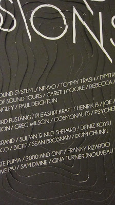
Brief 04 - D&AD Ministry of Sound collaboration
Brief 05 - The Specials
Brief 06 - Digital print resources. Postponed (possible FMP)
Brief 07 - Louise Tiler (small brief no boards submitted)

There are also lables for Crit/Tutorial, Evaluation and Time Management on this blog.

Here are my final submission boards in PDF form...


End of module evaluation

The briefs I initially choose for this submission were all type based, an area I wanted to build my skills and interest. This could have gone badly wrong if I decided I hate type throughout the module, however it has done the opposite. This is the first module  can say I have enjoyed thoroughly and feel I have truly learnt alot about design practices and my own professional place in the industry.

Brief 01 threw me into the deep end, designing a font. This was good for me as I couldn't slack. I pressured myself with an intense brief and it really made me work hard from the beginning. A negative is that I didn't give myself enough time to digitise the letterforms and make them into a usable font. The file is digital, but the kerning is all wrong. Also the finishing of some of the letterforms is a bit messy, which could have easily been avoided.

Brief 02 and Brief 06 were both took big a task to complete for this module and are possible briefs for FMP. I have some research for them already.

Brief 03 focused on identity, which was never a massive part of my practice before, however I like applying one concept throughout a range, and this exhibition design was a high for me. Seeing it come together after hating my chosen stock was such a positive step. It taught me to keep with something and find a way around a problem, don't just give up.

Brief 04 is potentially the one which will change my future... Steph Bourne and I worked so well together, we listened and shared ideas and in the end came up with a product neither of us would have done on our own. There is a possibility of us starting our own practice after university, it is an avenue which I personally am going to think about over Christmas and decide upon in the New Year. Before This brief, I would never of thought about setting up on my own, but the work that both of us have produced this module has surpassed my expectations in both quality and quantity. I am not blowing my own horn, but finally I believe some confidence in my ability is appearing.

Brief 05 has not reached its full potential. This could have been taken so much further, but I ran out of time and, in honesty, patience. I do feel like this could have worked so much better as a bigger range and for that I am disappointed. The typefaces for each song are acceptable, however they could have been pushed further also. As one off pieces, I like them and would have the prints on my wall, but as a range, I believe they are quite weak.

In conclusion and in reference to my rational... My vision of what I wanted to achieve this year has been surpassed. I have produced more quality work than I initially thought I could in the time available. This is down to realistic time management and working with hand-drawn typography. I could draw letterforms all day long, and probably for 20% of this module, I have. Truly believe I have found my place in Graphic Design and intend to stay on course for FMP and my Dissertation.

Tuesday, 13 December 2011

Deliverables for Brief 04

September 3D typographic environmental A2 poster
October 3D typographic environmental A2 poster
November 3D typographic environmental A2 poster
Environment installations
Promotional video

Saturday, 10 December 2011

Production - Oct

We were aiming to make both Oct and Nov in one day, however Nov took longer than expected and the colours did not come out right on the nets. The purples came out pink and even though we could have Photoshopped these for our boards, the actual poster would look rubbish in comparison. Also the nets were took long and stuck out a stupid amount. We decided to remake this poster on Monday. It means our deadline is tight and we have to work harder and faster on other things, but it should be worth it in the end.

12.12.11 UPDATE!
Made the poster today and so now the set is complete! Need to take some better photographs and Photoshop the selotape out for submission boards though!


Production - Nov

This took alot longer to produce than Sept as the nets were more complicated. Once it was completed it is definately worth the hours spent!


Friday, 9 December 2011

Final crit

FINAL CRIT! This was really good to get feedback from my boards. Other people can see things which I have missed. I can make the changes to my final boards as and when I finish the projects.

IMAGES OF FINAL BOARDS AND CRIT

Wednesday, 7 December 2011

Production of printed ephemera

The quality of production needed to be high as the stock I have used is pretty thin and could easily look cheap. My crafting skills are not that good, so this took quite a while!


Monday, 5 December 2011

Production - Sept

Once we had made all the triangles, which were to be the main element of the 3D effect we discussed how we could make they type 3D aswell and came up with this idea. The text could either be popping out or in. We decided to go with the in, as it might look like the poster was growing out from the centre.


Now every element had been worked out, we could start by creating the piece. We both know that the crafting is no where near perfect (sellotape!) however, we decided we could Photoshop this out quicker than we could actually make it perfect and so for us, this was the best way to tackle our lacking craft skills!


Triangles - Sept

Crafting is not my strong point, and working out how to make 3D triangles was pretty hard for me as I find it quite hard to visualise 3D things. Our first attempts were pretty shoddy, but after working out a net which worked well we could find the right dimensions and perspective which worked best.

Once we knew which kind of triangles worked best, I printed the net in all different sizes onto the colours we had chosen for the September poster. In different sizes and colours, they really look wicked together!


They looked better on black than white, it just seemed to make them pop more and stand out. The 3D element is complimented by the black rather than the white.


Merging ideas

Today, Steph and I bought both our elements together and adjusted both to create a piece which worked. I showed my type and layout and Steph showed her ideas for the 3D and background. Some aspects of my layout had to be changed to work better with the 3D effect. Each poster will have the same layout, however the information, colour palette and shapes will change.

SEPT - triangles and green
OCT - circles and yellow
NOV - hexagon and orange

Below are the colours specified by Ministry of Sound and below that is our colour palette.


When looking at our ideas together, my layout had to change. From printing this at actual size it was easy to see where the issues were.


Sunday, 4 December 2011

Evaluation of week 9

Woah week 9. After a chat with Momma and Pappa Gage, I have realised that I have got into the habit of designing stuff that looks cool, but may not be legible and work as a piece of communication as well as it could. I need to be able to balance the aesthetic of something as well as the clear communication. A few bits of my exhibition identity (Brief 03) need tweeking so that they make sense to the general public and outsiders.

Another review is that of my involvement in pop-up shops and fares. I am feeling pretty deflated after only selling 1 print at the Vernon Street pop-up shop. I don't think it is the quality of the work, but more the audience who attend such events. I am glad that I have a large number of these prints to give away to studios, however I need to think about the audience in future about any selling opportunities I go forward with. I am hoping to sell some of these in a different avenue, but not at such 'craft heavy' events.

More work needs to be done on our collaborative competition brief (Brief 04) and hopefully me and Steph will be wrapping this up tomorrow. I am hoping to extend this brief slightly, but am unsure yet how to do this until we have the main part completed.

A Type of Show identity (Brief 03) made a bit step forward this week, and I made quite a big change to the identity by simplifying it and only using one logo rather than a range. This will make it more visually similar and I am proud (yes, proud) of the one logo I have created and am using.

This coming week I also need to spend some time on extending Exhilaro (Brief 01) I can do this easily, I just need to DO IT!


Monday, 28 November 2011

Evaluation of week 8

Well, finally, all of my posters have been printed and the packaging is sorted! Also, I know how to best use my stock for Brief 03 (exhibition) annnnd the layout for my collaborative competition brief is done. It has been another one of those higgeldy piggeldy weeks where again I have not completed a brief, but I have done alot of major bits for a few of them. This week I need to complete 2 of my brief to get back on track.

By Friday I will have Brief 03 and Brief 04 completed! This will leave me a bit of time to expand Brief 01 and Brief 05 and also create my boards to a high standard.


Sunday, 27 November 2011

Layout

By getting Stephs feedback on my layout ideas I can get an understanding whether it will work with a geometric background and if she thinks she can work with it. It would be a shame if the layout looks great with no background of 3D, and then gets extremely confused and over complicated when the illustrations are applied. Steph liked the two layouts which I starred previosouly so I have digitised these and now I can now pass these over to her to look at the geometric shapes and more illustrative stuff. Meanwhile I can continue to look at folds and we can create the final pieces quickly.


Layout ideas

By creating loads of different layout taking into consideration the heirarchy I have worked out previously. I starred the ones which I think could work well with a geometric background.

IMAGE

Thursday, 24 November 2011

Complimentary type

To go alongside the type I have created for 'Saturday Sessions' I think a similar font would be best.  I do want it to look different though. It needs to be easily legible and communicate the information rather than expressing character.


When shown alongside the type I just created, these few work best... They are Champagne & Limousines, Ostrich Sans Rounded Medium, GeosansLight and DIN-LightAlternate.


When viewed from a distance, Ostrich Sans Rounded Medium, is hard to read. The spacing is way too tight and when read with Saturday Sessions it confuses my eyes weirdly, I guess it is the change in kerning. DIN-LightAlternate doesn't work well either. The shape of the letter has more of a serious tone than the theme. Initially I wanted a different font than the one I have messed with, but it turns out in this case it is probably the best! I am going with Champagne & Limousines as the supporting font.


Final type

Here is the final type! This can be made 3D or kept flat. Depending on the illustration/background which Steph comes up with I can alter this so that it works the best. We don't want the type to be fighting with the background but for the whole thing to work together. I now need to find a complimentary typeface to go alongside this which will communicate the details of each event.


Type progress

By editing and moving the nodes in Illustrator for each typeface I have created some different versions. My first attempts are at the bottom working the way up.


My favourite is the third one down and so now I have tried messing about with the sheer tool as this will give it more character and a 3D effect to compliment our concept.


From these I have chosen to take forward the fourth one down. From here I can see how the words can interact with each other, and think more about layout...


I have my favourite! It needs a bit of tweeking to make it fit together nicely and possibly some extra detail in the shape of the end of stems. These finishing touches will make the type look more professional.


Fonts to fuck with

Made a list of what I could do to maker the 'Saturday Sessions work with our theme and concept, and the brand.

IMAGE.

The image in my mind is a sans serif font with additions and subtractions from the detail such as counters, stems etc... Here are my shortlist of possible fonts to use...


From this long list I have narrowed it down a bit more to 3... I will mess about with these and add and subtract the elements which I want to find the one which works the best. I can use another font for the information. These fonts below are Akzidenz-Grotesk BQ Condensed, Champagne & Limousines and MLB Astros.


Wednesday, 23 November 2011

Typography ideas

Thinking about 2 different font styles for the poster. One more custom lettered for the 'Saturday Sessions' and one more generic and readable for the information on the posters.

After having a chat with Steph we have been able to be clearer about our ideas. We basically want to utilise these two processes. The type to be in this style and the 3d/illustrations to be in this style...


Hierarchy

Beautiful Meme said that one thing graduates lack is hierarchy in type. I think this is one area that I do take into consideration, but not one which I really think alot about. As there is so much typographic content and information to go onto these posters, I have address hierarchy more indepth.