
Poster to reflect 5 aspects of our collaborative team.
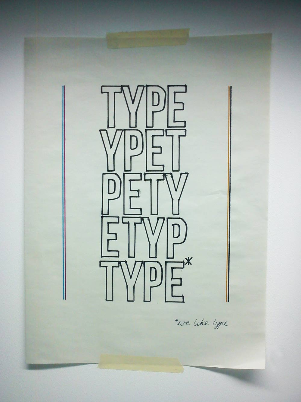
Our poster reflected our love of typography, colour and print along with out design direction skills in concept development and identity.

The winning posters looked more refined and our didn't make the top 3, but was chosen by quite a few as their favourite. Positive comments from peers and no critical feedback meant it was hard to pin point something to change. We discussed changing the words but Jane suggested we don't make any big changes, but maybe focus more on the message of type and add a bit of colour. We decided upon pink, blue, yellow and black to further reinstate the message of print (cmyk). Jane suggested just saying type x5, and later I came up with re-arranging the letters x5. I think this communicates less about us but more effectively and shows that type is our primary. It doesn't really have an identity. Maybe we should have stuck with our original idea but simply added a little bit of colour (cmyk) and created some more white space around the 5 keywords whilst keeping the furniture in place. Looking at it now, I think we changed too much...
The winning posters were really good and I especially like Arthur and Jo's (far left). I think it speaks to the audience and was so simple and effective. A really good idea, but they were lucky they are next to each other on the register!

Winning posters.
No comments:
Post a Comment