These little pots are my favourite as they are cute! Ideally it would be great if I could design and produce my own jars but at this time that is impossible.
Front view (as the customer would see).
Lids of jars.
I will create my own label to put around the jars and also have a different coloured lid to go with my brand identity.
I wanted to continue the theme taken from my main image. I have used the same method but have used relating condiments to words.
Instead of using Marmalade and Jam I am using the main ingredient such as Orange and Raspberry. This is for ease and also will make my brand stand out for being simple and different. It helps my customers make a fast choice if they can see clearly what they are getting.
Printed toast.
Printed toast with condiment detail.
From these prints onto toast I can adapt them for each condiment. Using Lime as a dummy I have looked into different typefaces and need to see which works best alongside the image. As the typography on the toast is hand-drawn, I do not want the suporting text to overpower this. It need to be simple, but also welcoming to the audience.
L printed toast with lime condiment.
Additional letterforms making up the word Lime in Peach Sundress.
Academy Engraved LET.
Futura Medum Italic.
Helvetica Neue.
Mona Lisa Solid.
Nueva Std Bold Condensed Italic.
Optima Bold Italic.
Perpetua Bold Italic.
Walkway Bold.
Adobe Fangsong Std.
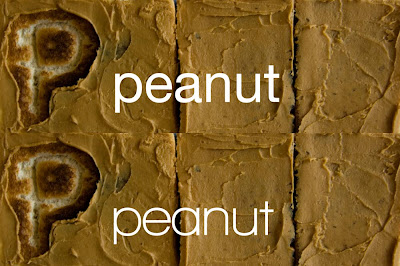
I think out of my selction, Helvetica Neue and Walkway Bold work the best. I will exeriment with these more to get the best result. The typeface I choose will be used on all other packaging solutions and promtional material.
Raspberry typography experiment.
Orange typography experiment.
Peanut typography experiment.
Hazelnut typography experiment.
I definatly prefer the examples using Walkway Bold. I think Helvetic looks a bit boring and I need something which has enough interest to keep in line with my range... but not too much to detract from the illustrative type on the toast. Here are my final labels to go onto my jars... I am really happy with them!
Final packaging jar labels.
Final packaging jar labels.


No comments:
Post a Comment