
Image is my comfort zone. This 1 week individual project is based on type. My weakness at present! I must create a set, series or sequence of 10 letterforms which explore and communicate the word "Compress" which I chose out of the "Randomizer". The brief states that I should focus on the manipulation of existing letterforms.
MONDAY 28.09.09
I am really excited about this brief as I can really push myself and use my own ideas. I started by jotting down what I immediately thought of when "Compress" was suggested to me. A metal crusher came to my head to start with, as well as something being squeezed to fit into a smaller space. When I got home I looked through the Dictionary and Thesaurus for more ideas and then began to sketch out some preliminary ideas.
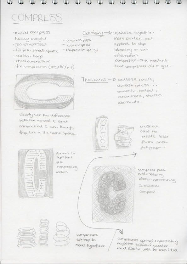
Currently, I am keen on the concept of numerous crushed cans (representing the compression) making the letter... Through development of this idea and remembering the "Type and Form - An Introduction to Type" talk with Fred this morning, I wonder if I could use this idea but use the cans to show the negative space/counters. I also like the thought of using arrows to demonstrate the compression. This might fit the brief more comfortably as it wouldn't be so dependent on an image/photograph to represent the "Randomizer" word... I could make the arrows in the same style as my manipulated letterforms, thus possibly making them seem part of the typeface.
WEDENSDAY 01.10.09
Today I decided upon the can idea and compressed some to develop which way of compressing would be the most effective. I think it would be better to compress the cans from the top opening down to the base, instead of sideways. This way it creates more detail and I can layer them showing the side (as if they are stacked).

I also started looking into which typeface I could manipulate to create a "Compressed" effect. I thought about what are the characteristics of the word "Compress". I also thought about whether upper/lowercase would be most appropriate. Capitols seem to have more of an impact and appear more powerful... However if something is being compressed then that is the weaker matter, so maybe lowercase would be a better representation.
I sifted through Font Book and selected typefaces which I thought would work well compressed.
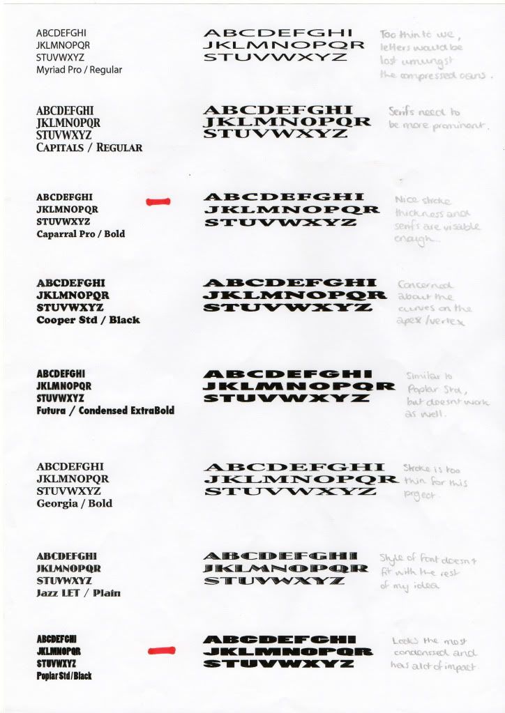
I selected Caparral Pro / Bold and Poplar Std / Black as the ones which worked best when manipulated in Illustrator. Some of the fonts I chose were too thin or had very small serifs which I believed would be difficult to re-produce with beer cans. I decided to use Poplar Std / Black for my final design as It looked the most condensed and had a lot of impact.
Printing media was also on my mind and I began to think about what would be the most effective media to portray "Compress". I thought about crushing a piece of paper in my hands and it having a really organic look. I experimented with plain paper and newspaper. I like the feel and overall look of using the newspaper, however I am a bit concerned about how the print would appear on the media as my image will be quite detailed with lots of compressed cans. I will experiment with this more on Friday once all my letters have been finalised.
THURSDAY 02.10.09
Today I figured out exactly what to do for each letterform and how I would go about it. I photographed a can from the side after compressing it and then used the Path tool in Photoshop to get rid of any background. These images were then layered up in the negative space created from the letterform.

Landscape suited my word better so that the letterform (or negative space) can still have alot of the space on my A6 sheet. I have decided upon the 10 letters I will use for my piece. They will spell out the word "Compressed" to tie in with my chosen "Randomiser" word. I will use different cans for each letterform.
FRIDAY 03.10.09
On Thursday evening I managed to photograph more cans and created most of my letters. On Friday morning I was finishing these and printing. I decided to print on bog standard paper and crush the prints in my hand, to give a compressed effect.


ILLUSTRATOR
I also had an Illustrator Brief on this idea where I had to create 26 variation of one of my letterforms created. I had a workshop in Illustrator (which I didn't enjoy as I already knew how to use Illustrator). I'm sure the workshop was useful for most people but I just don;t think I needed to attend and could have spent my time more productively. However, I did complete the task. We could only use one colour and we were mainly using the pen tool to draw around our letterforms and edit them to create variations.

No comments:
Post a Comment