
09.03.10 - Me You Us
For this project I will be working with one other person. We had to write down our skills and attributes and also what skills/attributes we wanted in our partner. We then made an advert for ourselves and anonymously choose corresponding adverts which we thought suited us. The idea was to get a good match in a partner for this project.


I wanted someone with different skills to me (an illustrator mainly) however I would have liked them to have similar attributes so we could work well together. Me and Jonny Finch are working together and we make a good team. We worked together on one of our very first briefs 'How to...' and enjoyed working together and got some good research also. From what I have seen of Jonnys working I think our styles compliment each other.
We have chosen to try and get people to talk/communicate more. Through discussions and initial research we are planning to involve different nationalities in communication within the City. Check out the brief for a more in-depth view of what we aim to achieve and how. We started talking about what we could do and shared examples we knew of happy, smiley, communication graphics. We plan to create a questionnaire soon which should give us some great primary research on communication. The initial research we did was on statistics on the population in Leeds. We found out that the population stands at White 91.8% (very close to the national average) Pakistani 2.1% and Indian 1.7%. I thought this was pretty hard to target such a small percentage, however as the total number of people stood at 715,402 (when this data was collected) that still gives us a target audience of around 27,185 only including Pakistani and Indian.
11.03.10 - The ignorant English
We regrouped today and both decided that with the amount of time we have and our limited knowledge of other cultures, getting people to communicate more with other cultures and nationalities may be a bit too tricky! We spoke about how we could maybe get other people to learn a new language, as this would open up the lines of communication when in another country and on home soil also. Our directions have changed from getting people to communicate more to getting people to try something new. Our initial research is still very relevant and will be used, but we have also found out language facts and done a questionnaire to gather some more primary research on what languages people know currently and what is holding them back from learning another.
The top 10 languages in the world are...
The data collected has been helpful in giving us good primary research and a clear basis on which to begin our design... however it is quite a small sample and with the majority of people questioned being under 20, our audience is not very broad. We ideally would like to target a cultured audience from 35-55 as we believe this group would be more willing and keen to learn a new language. Because of this, I have sent the questionnaire out again, but to a more suitable age-range, so we can collect data specific to our target audience.
15.03.10 - Concept, Content, Method of Delivery
Our boards have been created by hand and not computer. We believe this to have a more personal feel and I would really like to use illustration in our design as a means of communication. We aim to create something similar to Dave the Chimp happy people which were placed around London with sketches a zine and a comment to make people smile and more happy. I think this would be a good way to communicate with our target audience, however using paper folding rather than a plastic container.
What
Encourage cultured individuals to learn a new language (relevany to the country) before they travel.
Why
Generally the English do not know a second language and rely on the natives to know English.
Who
An age-range of 35-55 as this group will tend to think more about travel and hopefully be more open to learning.
How
Interactive paper manipulated information packs containing appropriate information with a personal feel (not corporate!).
Where
Around cultural hot-spots around Leeds such as Library's and Galleries.


We have chosen to try and get people to talk/communicate more. Through discussions and initial research we are planning to involve different nationalities in communication within the City. Check out the brief for a more in-depth view of what we aim to achieve and how. We started talking about what we could do and shared examples we knew of happy, smiley, communication graphics. We plan to create a questionnaire soon which should give us some great primary research on communication. The initial research we did was on statistics on the population in Leeds. We found out that the population stands at White 91.8% (very close to the national average) Pakistani 2.1% and Indian 1.7%. I thought this was pretty hard to target such a small percentage, however as the total number of people stood at 715,402 (when this data was collected) that still gives us a target audience of around 27,185 only including Pakistani and Indian.
11.03.10 - The ignorant English
We regrouped today and both decided that with the amount of time we have and our limited knowledge of other cultures, getting people to communicate more with other cultures and nationalities may be a bit too tricky! We spoke about how we could maybe get other people to learn a new language, as this would open up the lines of communication when in another country and on home soil also. Our directions have changed from getting people to communicate more to getting people to try something new. Our initial research is still very relevant and will be used, but we have also found out language facts and done a questionnaire to gather some more primary research on what languages people know currently and what is holding them back from learning another.
The top 10 languages in the world are...
- Mandarin
- English
- Spanish
- Hindi
- Russian
- Arabic
- Portuguese
- Bengali
- French
- Malay, Indonesian
The data collected has been helpful in giving us good primary research and a clear basis on which to begin our design... however it is quite a small sample and with the majority of people questioned being under 20, our audience is not very broad. We ideally would like to target a cultured audience from 35-55 as we believe this group would be more willing and keen to learn a new language. Because of this, I have sent the questionnaire out again, but to a more suitable age-range, so we can collect data specific to our target audience.
15.03.10 - Concept, Content, Method of Delivery
Our boards have been created by hand and not computer. We believe this to have a more personal feel and I would really like to use illustration in our design as a means of communication. We aim to create something similar to Dave the Chimp happy people which were placed around London with sketches a zine and a comment to make people smile and more happy. I think this would be a good way to communicate with our target audience, however using paper folding rather than a plastic container.
What
Encourage cultured individuals to learn a new language (relevany to the country) before they travel.
Why
Generally the English do not know a second language and rely on the natives to know English.
Who
An age-range of 35-55 as this group will tend to think more about travel and hopefully be more open to learning.
How
Interactive paper manipulated information packs containing appropriate information with a personal feel (not corporate!).
Where
Around cultural hot-spots around Leeds such as Library's and Galleries.

- Concept, Content and Method of Delivery boards for crit
Some good feedback came from the crit. Our little interactive information packs will be screen printed and we need to experiemtn with different processes to create the desired effect. As we can only use 2 colurs plus stock, screen printing would also enable us to use a third and achieve different tones from the colours through overlaying inks and using halftone. These are techniques I learnt during the printmaking workshop at Blenheim.
We drew up a contract also which states our individual and joint roles in this project. As we both have a clear understanding of what we want/need to create we can designate tasks specifically. I will be looking primarily into nets and folding techniques for the actual information pack and Jonny will be experimenting with the design and style of illustration. We can then share our work and find the best solution collaboratively to screenprint and bring the whole thing together later in the week.
19.03.10 - Nets, nets, nets!
As I was looking into nets, I started sketching some ideas down. We both really liked the idea of a pocket and also the two way book effect... however we thought the double book net may not be appropriate for what we were saying as we may feel we had to fill every page with information, and this would just become boring I feel. Information overload is not what we were going for!


Jonny did some illustrations, and even though we are limited to 2 colours, he used quite a few... but it really helped us visualise the overall feel of the booklet. They look really nice and our ideas are working together well.

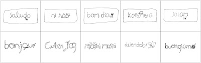
We chose to use the book and pocket net and the hand drawn text/illustrations and made a net and a start on the booklet design. We are going to create a small booklet containing information on why people should learn a new language and where they can do this. The booklet will have an attached pocked which will hold 10 communication cards. These cards will have a greeting and some useful phrases and translations. There will be 10 cards in each booklet set, each in a different language. We chose the languages used from our questionnaire and what people said was the language they would wish to learn. (Spanish, French, German, Polish, Arabic, Portuguese, Japanese, Greek, Italian and Chinese.)


22.03.10
We got some good feedback from Amber and other students on how we could improve our idea. An issue on legibility was raised on some of the communication cards. We should put the English word aswell on the cards so people know what they are actually saying along with the phonetic spelling, so they can say the words right! Also it was suggested that in order to target our audience effectively it would be better to place them inside institutions such as libraries and galleries instead of dotted around the city.
I did some designs for the outer of the envelope which would contain the booklet and pocket for the cards neatly. These designs are really rough and initial ideas. I would really like to use a colour for the side of the pocket as I think this would be a really nice little detail. Ideally the 'hello...' on the front would be in the same hand drawn illustration style used on the cards.

The cards look pretty simple but I think they are more effective with this style. They will have a colour behind the illustrated text with white inside the text. The cards are going to change from the addition of teh English and phonetic spelling, also the colour is bound to change slightly.

25.03.10 - 12 hours of blood sweat and tears.
Woah, today was manic. The tag line is true. Jonny actually started bleeding and I went insane... guess it was the 9 hours of straight of designing/printing and making. We went through quite a few changes today and everything came together. This is the final printed nets... No screen prints for this as we costed it up and it was just too expensive and to be honest, I think it looks just fine printed digitally anyways! We choose a colour to start with and the stock we would use.


26.03.10 - "Wow to the final packaging =)"
Friday morning gave us an opportunity to show what we had done and see everyone elses work. It was really nice to see the different concepts people had chosen to work with. We got some great feedback, and everyone seems to really like to packaging so that was great!


No comments:
Post a Comment