Friday, 4 March 2011
Rewritten brief
Firstly we had chosen Green & Blacks but then changed out mind to Ted Baker as we thought we could experiment more with this. I think if we had of done Green & Blacks, we would of produced something nice but maybe not pushed ourselves. This brief keeps growing on me and the more I research and we specify the brief, the more I like it. As it is quite open, we can explore different avenues and hopefully produce a piece of work which both answers the brief and solves a few other problems we have come across too.... aswell as sticking with our original roots of type and print primarily.
Wednesday, 2 March 2011
Type 6
I have pulled out a different quote for each of the different editorials, along with the typographic and layout changes.
Sunday supplement...
I used a 4 column grid and altered the point size and leading. Also took out paragraph spaces and replaced with indents. For ease of the reader whether they want to read or not (hopefully they do) the pull quote has breathing space around it, allowing our eye to focus there with high priority. The image is supportive, but does not add much, if anything to the text all be it to break it up and look more welcoming... not a bit block of text.
16-21 magazine...
3 column grid to add interest and made text look as friendly and not over powering as possible. Looks like much less text, I need to print out and check this is still legible. Also title does not say 'essay' anymore but instead is a relevant pull quote for more audience stimulation and interest in article.
Academic Journal...
My thoughts were that in an academic journal, readers would not be put off by a big block of text, especially if only on one page. The white space is pleasing to the eye for a ret but also it acts as a place where readers can make notes, as this is in an academic journal, I think this would be useful to the audience.
Homework was set to create an 8 page leaflet...
Sunday supplement...
I used a 4 column grid and altered the point size and leading. Also took out paragraph spaces and replaced with indents. For ease of the reader whether they want to read or not (hopefully they do) the pull quote has breathing space around it, allowing our eye to focus there with high priority. The image is supportive, but does not add much, if anything to the text all be it to break it up and look more welcoming... not a bit block of text.
16-21 magazine...
3 column grid to add interest and made text look as friendly and not over powering as possible. Looks like much less text, I need to print out and check this is still legible. Also title does not say 'essay' anymore but instead is a relevant pull quote for more audience stimulation and interest in article.
Academic Journal...
My thoughts were that in an academic journal, readers would not be put off by a big block of text, especially if only on one page. The white space is pleasing to the eye for a ret but also it acts as a place where readers can make notes, as this is in an academic journal, I think this would be useful to the audience.
Homework was set to create an 8 page leaflet...
Indecisive...
I am very indecisive, and me and Ailsa couldn't pick a brief for ages... maybe we over thought it but we changed our minds a million times. We could see positives and negatives in each and I don't think we knew enough about any of them to comfortably pick one. Buuuut... we finally settled on Ted Baker (after narrowly choosing Green & Blacks) I am really happy with our selection and as I have researched more I am confident we can produce something which answers the brief and more.
Tuesday, 1 March 2011
HA!
Hazel + Ailsa = HA!
Poster to reflect 5 aspects of our collaborative team.
Our poster reflected our love of typography, colour and print along with out design direction skills in concept development and identity.
HA! Initial poster.
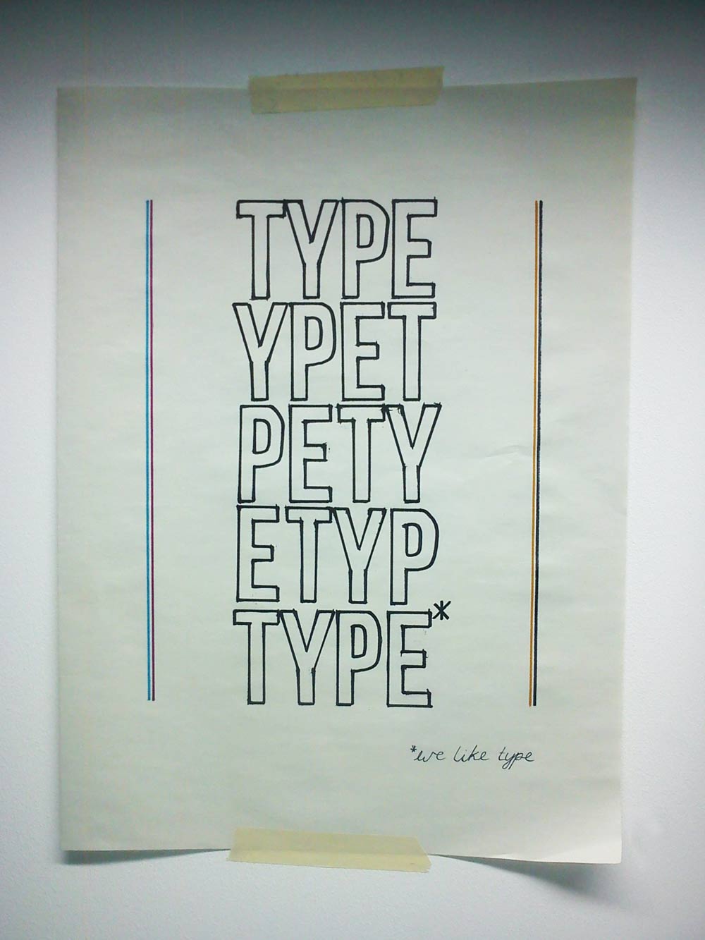
The winning posters looked more refined and our didn't make the top 3, but was chosen by quite a few as their favourite. Positive comments from peers and no critical feedback meant it was hard to pin point something to change. We discussed changing the words but Jane suggested we don't make any big changes, but maybe focus more on the message of type and add a bit of colour. We decided upon pink, blue, yellow and black to further reinstate the message of print (cmyk). Jane suggested just saying type x5, and later I came up with re-arranging the letters x5. I think this communicates less about us but more effectively and shows that type is our primary. It doesn't really have an identity. Maybe we should have stuck with our original idea but simply added a little bit of colour (cmyk) and created some more white space around the 5 keywords whilst keeping the furniture in place. Looking at it now, I think we changed too much...
Poster to reflect 5 aspects of our collaborative team.
Our poster reflected our love of typography, colour and print along with out design direction skills in concept development and identity.
HA! Initial poster.
The winning posters looked more refined and our didn't make the top 3, but was chosen by quite a few as their favourite. Positive comments from peers and no critical feedback meant it was hard to pin point something to change. We discussed changing the words but Jane suggested we don't make any big changes, but maybe focus more on the message of type and add a bit of colour. We decided upon pink, blue, yellow and black to further reinstate the message of print (cmyk). Jane suggested just saying type x5, and later I came up with re-arranging the letters x5. I think this communicates less about us but more effectively and shows that type is our primary. It doesn't really have an identity. Maybe we should have stuck with our original idea but simply added a little bit of colour (cmyk) and created some more white space around the 5 keywords whilst keeping the furniture in place. Looking at it now, I think we changed too much...
The winning posters were really good and I especially like Arthur and Jo's (far left). I think it speaks to the audience and was so simple and effective. A really good idea, but they were lucky they are next to each other on the register!
Winning posters.
I am a Shepherd
Print based editorials with a large focus of typography. Stressed but always passionate. Work hard play hard. Trends are cool if you're the Shepherd, not if you're the sheep.
Subscribe to:
Posts (Atom)