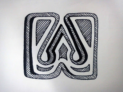
I want to show "Hate Week' as a good thing, when clearly by the name, it is not. By illustrating the type to make it look positive I hope to achieve this juxtaposition which can be used across my range consisting of a poster, banner, gin bottle, cigarette packet and animation.


No comments:
Post a Comment