Wednesday, 14 December 2011

OUGD301

My briefs have overlapped alot on this module, which has resulted in a very jumbled blog. Please use the 'relevant lables' widget on the right hand side of this page to view each specific brief. I am only submitting Brief 01, Brief 03. Brief 04 and Brief 05 as major briefs.

Brief 01 - Exhilaro
Brief 02 - Achitecture publication. Postponed (possible FMP)
Brief 03 - A Type of Show
Brief 04 - D&AD Ministry of Sound collaboration
Brief 05 - The Specials
Brief 06 - Digital print resources. Postponed (possible FMP)
Brief 07 - Louise Tiler (small brief no boards submitted)

There are also lables for Crit/Tutorial, Evaluation and Time Management on this blog.

Here are my final submission boards in PDF form...


End of module evaluation

The briefs I initially choose for this submission were all type based, an area I wanted to build my skills and interest. This could have gone badly wrong if I decided I hate type throughout the module, however it has done the opposite. This is the first module  can say I have enjoyed thoroughly and feel I have truly learnt alot about design practices and my own professional place in the industry.

Brief 01 threw me into the deep end, designing a font. This was good for me as I couldn't slack. I pressured myself with an intense brief and it really made me work hard from the beginning. A negative is that I didn't give myself enough time to digitise the letterforms and make them into a usable font. The file is digital, but the kerning is all wrong. Also the finishing of some of the letterforms is a bit messy, which could have easily been avoided.

Brief 02 and Brief 06 were both took big a task to complete for this module and are possible briefs for FMP. I have some research for them already.

Brief 03 focused on identity, which was never a massive part of my practice before, however I like applying one concept throughout a range, and this exhibition design was a high for me. Seeing it come together after hating my chosen stock was such a positive step. It taught me to keep with something and find a way around a problem, don't just give up.

Brief 04 is potentially the one which will change my future... Steph Bourne and I worked so well together, we listened and shared ideas and in the end came up with a product neither of us would have done on our own. There is a possibility of us starting our own practice after university, it is an avenue which I personally am going to think about over Christmas and decide upon in the New Year. Before This brief, I would never of thought about setting up on my own, but the work that both of us have produced this module has surpassed my expectations in both quality and quantity. I am not blowing my own horn, but finally I believe some confidence in my ability is appearing.

Brief 05 has not reached its full potential. This could have been taken so much further, but I ran out of time and, in honesty, patience. I do feel like this could have worked so much better as a bigger range and for that I am disappointed. The typefaces for each song are acceptable, however they could have been pushed further also. As one off pieces, I like them and would have the prints on my wall, but as a range, I believe they are quite weak.

In conclusion and in reference to my rational... My vision of what I wanted to achieve this year has been surpassed. I have produced more quality work than I initially thought I could in the time available. This is down to realistic time management and working with hand-drawn typography. I could draw letterforms all day long, and probably for 20% of this module, I have. Truly believe I have found my place in Graphic Design and intend to stay on course for FMP and my Dissertation.

Tuesday, 13 December 2011

Deliverables for Brief 05

5x type treatments
1x ghost town white print
1x ghost town black print (artwork created but not printed)
1x ghost town white vinyl (artwork created but not printed)
1x ghost town black vinyl (artwork created but not printed)

1x too much, too young white print (artwork created but not printed)
1x too much, too young black print
1x too much, too young white vinyl (artwork created but not printed)
1x too much, too young black vinyl (artwork created but not printed)
1x a message to you, rudy white print (artwork created but not printed)
1x a message to you, rudy black print (artwork created but not printed)
1x a message to you, rudy white vinyl
1x a message to you, rudy black vinyl (artwork created but not printed)
1x rat race white print (artwork created but not printed)
1x rat race black print 
1x rat race white vinyl (artwork created but not printed)
1x rat race black vinyl (artwork created but not printed)
1x friday night, saturday morning white print (artwork created but not printed)
1x friday night, saturday morning black print (artwork created but not printed)
1x friday night, saturday morning white vinyl (artwork created but not printed)
1x friday night, saturday morning black vinyl


Deliverables for Brief 04

September 3D typographic environmental A2 poster
October 3D typographic environmental A2 poster
November 3D typographic environmental A2 poster
Environment installations
Promotional video

Deliverables for Brief 03

Identity (logo, spot colour and typeface)
Exhibition guide
Exhibition leaflet double sided A4
Environment installation (produced at a smaller scale and Photoshopped
Wayfinding
Exterior decoration of gallery
Plaques for exhibited work


Deliverables for Brief 01

Exhilaro font
1x specimen booklet
1x specimen PDF
1x A2 double sided print
10x A6 postcards
Online promotion


December

Sunday, 11 December 2011

Online prescence

On my Design Context I looked at which online foundrys could sell my font and came down to You Work For Them and Colophon Foundry. Shown below are the images I would be Photoshopping to make it seem like they are selling Exhilaro.


Personally, I like the look of Colophon Foundry and think this would compliment my font better. I have edited the web page shown above to be featuring Exhilaro.


PDF specimen

Finally got round to making the PDF version of my specimen booklet. From looking at Playtype and Process Type Foundry, along with my main influence, Colophon Foundry it was pretty easy to know what information needed to be included.  This is a downloadable file form the internet and will be available for free from the same page as the font. I now need to mock up my banners and images for the website promotion and information. Mocked up the PDF in context on an iPad to show the use.


Net issues

For the vinyl I want to print it on a2... however the net is slightly bigger. I have had to make the net smaller, which means that it may not be quite big enough to actually hold the record! I really wish that A2 was just 2cm bigger!


Cardboard packaging

The posters will be packaged in my poster tubes, similar to when I sold them at the Leeds College of Art Pop-Up Shop. One tube will contain all 5x white prints or 5x black prints. The same will be for the packaging of the vinyls. One box will contain 5x white and the other 5x black. Ideally I want the box to be cardboard and have a small sticker as like the tubes explaining the content, bar code and price.

14.12.11 UPDATE!
Did not have time to print all 20x versions of my prints and vinyls so this packaging was a waste! Only 3x posters and 2x vinyls have been submitted.

Vinyl

From my research I have come up with these simple and effective designs for the vinyl sleeve. Applying the typographic song titles to black/white vinyls for production. This will be the other deliverable for Brief 05. I feel like there is not enough... just posters and vinyls. But there are 5 records which each have a black and white edition... so in total there are 20 deliverables. I just hope I can get them all printed in time for submission, otherwise it will not have a great impact as I want.


Saturday, 10 December 2011

Prints ready to print!

Here are the black and white versions of all prints for submission of Brief 05. I need to apply these letterforms to vinyl now. Hopefully I can print all of these in time for submission as it could be great to be able to show them as a set.


Rat race

"You're working at your leisure to learn the things you'll need
The promises you make tomorrow will carry no guarantee
I've seen your qualifications, you've got a Ph.D.
I've got one art O level, it did nothing for me.
Working for the rat race
You know you're wasting your time
Working for the rat race
You're no friend of mine"

This make me thinkk of regimented office spaces with no persoinality. I want to show this in my typeface so have decided to go for this...


A regimented layout would work well with these lyrics and decoration of font...


This one is again landscape as it works best with the layout of text and the horizontal stripes inside work well with this layout too. 


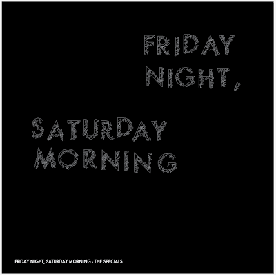
Friday night, Saturday morning

"Out of bed at eight am
Out my head by half past ten
Out with mates and dates and friends
That's what I do at weekends"

I want to communicate drunkeness...


I think with the misalignment of letters, it is hard to read when spaced around the page in the first layout. In the second, I read the whole text, and not have emphasis one one over another. For these lyrics that works best.