Saturday, 31 October 2009

OUGD101 No News Is Good News (Research)

This one week brief was all about research. I had to select a newspaper article from Saturday 17th October 09 and research the story. It was suggested that we choose an article which interested us and that we would be able to investigate further. The tone of voice was important and most newspaper articles are serious... the research had to be related in tone as well as subject to the article context.

The article I choose was titled "Lost city that may have inspired Atlantis myth gives up secrets".

I found this article really interesting because it mixes science with myth. I began by researching more into the Pavlopetri story. Then I focused on researching into Atlantis, bottom trawling ruining sea beds and the bermuda triangle. I choose these subjects as they are all related to my article and I find each of them quite interesting.

Tuesday, 20 October 2009

OUGD104 - A Visual Vocabulary (20.10.09)

I really enjoyed todays class. Anything that tricks the eye fascinates me. We had to produce a letter form over different planes similar to the Channel 4 current indent seen below. This uses a process called Match Moving using a rendering software, shown below the Channel 4 Indents.


My group consisted of Will Duffy, Ceara Elliot, Niall Hargrave and myself. We all bought in boxes and decided to present H from they typeface Credit Valley. We placed the boxes on the table whilst looking though a viewfinder attached to our desk space to see how we could show the letterform. Once we were all happy with the placement of these we began cutting out pieces of card to attach to the boxes to present H. We had to decrease the size of the parts of the letterforms which were closer to the viewfinder for it to look like it was a flat image. We worked really well as a team and got the task done in time, and we were all really happy with the final result!

Friday, 16 October 2009

OUGD104 - A Visual Vocabulary (13.10.09)

In this session I had to portray the work "Scale" in 5 separate frames. We then swapped these with someone else in the group. I had to then make 3 variations of each of my other persons work, creating 20 frames in total (including their 5 original ones).


When we had done this we picked the one set we thought represented "Scale" the best and put it up on the wall. I think the last image shown here worked the best as the larger letterforms are presenting the same shape as the smaller letterforms. Another person in the group did the same thing with my work.

I can see his reasoning for what he has done and I do think its represents scale accross the frames and they also work individually.

Wednesday, 7 October 2009

OUGD104 - A Visual Vocabulary (06.10.09)

On Tuesday with Amber we again had to represent words in a frame, however this time we had to use 4 frames in a line to represent the word. We still had the same restrictions, we were supplied with 4 typefaces (Times New Roman, Gill Sans / Ultra Bold, Futura and Helvetica) with the letterform "A" in large and small sizes. The words we had to demonstrate were edit, jumble, hybrid, extend and deconstruct.

Once we had shown these in the frames, we then had to think about how to represent the words in just one frame. I had to think about whether to keep the process the same or to change my idea of how I was representing the words as some wouldn't work the same. The group swapped seats and we had to figure out which frames meant which word. Whoever got mine got them all correct, meaning that I represented the words clearly, that they could be identified.

EDIT
I "edited" one letter in the sequence and repeated this across the 4 frames to demonstrate the word. In the 1 frame, I showed this process twice, as not to get confused with hybrid.

JUMBLE
I used the 4 frames as 1 to demonstrate a flow of jumble using all the typefaces and different sizes. For the one frame I compressed all these into a pile of jumble.

HYBRID
For the 4 frames, I mashed together 2 very different typefaces (Gill Sans / Ultra Bold and Futura) and showed the process of this. For the 1 frame I created a "A" from all the different typefaces as I though if I just repeated frame 4 it may represent jumble.
EXTEND
I extended a line of "A"s for the 4 frames and attempted to do the same within the 1 frame.
DECONSTRUCT
In the 4 frames, I showed the deconstruction of the letter "A" made from different typefaces. For the 1 frame I attempted to show an already deconstructed letter "A" although I only used one typeface, as though not to distract from my meaning.

OUGD101 Alphabet Soup "Ross Allman"

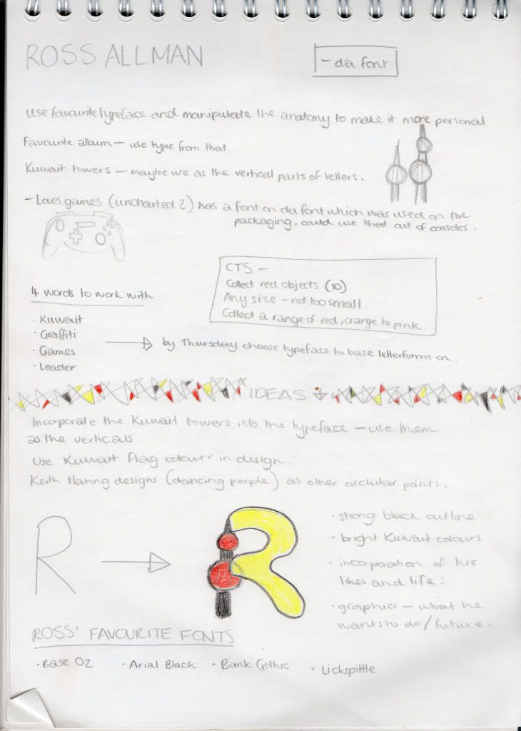
This brief is similar to the Summer Brief, although I must design a typeface for another person on the Graphic Design course. This must be a manipulated existing typeface, which gives me somewhere to start from. From the Randomiser, I was paired with Ross Allman.

MONDAY 05.10.09
We asked each other questions such as our earliest memories, our most treasured possessions and what super power we would have. From this session I found out that he moved to Kuwait when he was young and that is is most loved place. Also he loves gaming and game design. He describes himself as loud, boisterous and a leader. His most treasured possession is a Lamb teddy called Lamby that his Mum got given on the Maternity ward when he was born. Also he would bring back Keith Haring if he could. The person he most admires is Saul Bass. Ross likes...

I also asked Ross what his favourite typeface was. I thought this would make my font more personal if it was based around something he likes. He suggested:
  • ITC Avant Garde Gothic Book
  • Base 02
  • Arial Black
  • Century Gothic
  • Lick Spittle
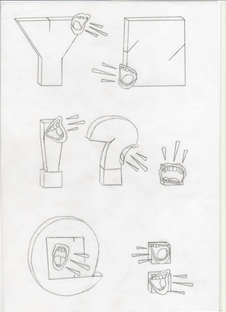
I sketched out an idea I had involving the Kuwait Towers and the style of Keith Haring. I though it might be cool to use the Kuwait colours aswell when I produce this.

I think I will try and decide more upon a design first and then choose one of the above to manipulate based on and ideas I have.

WEDNESDAY 07.10.09
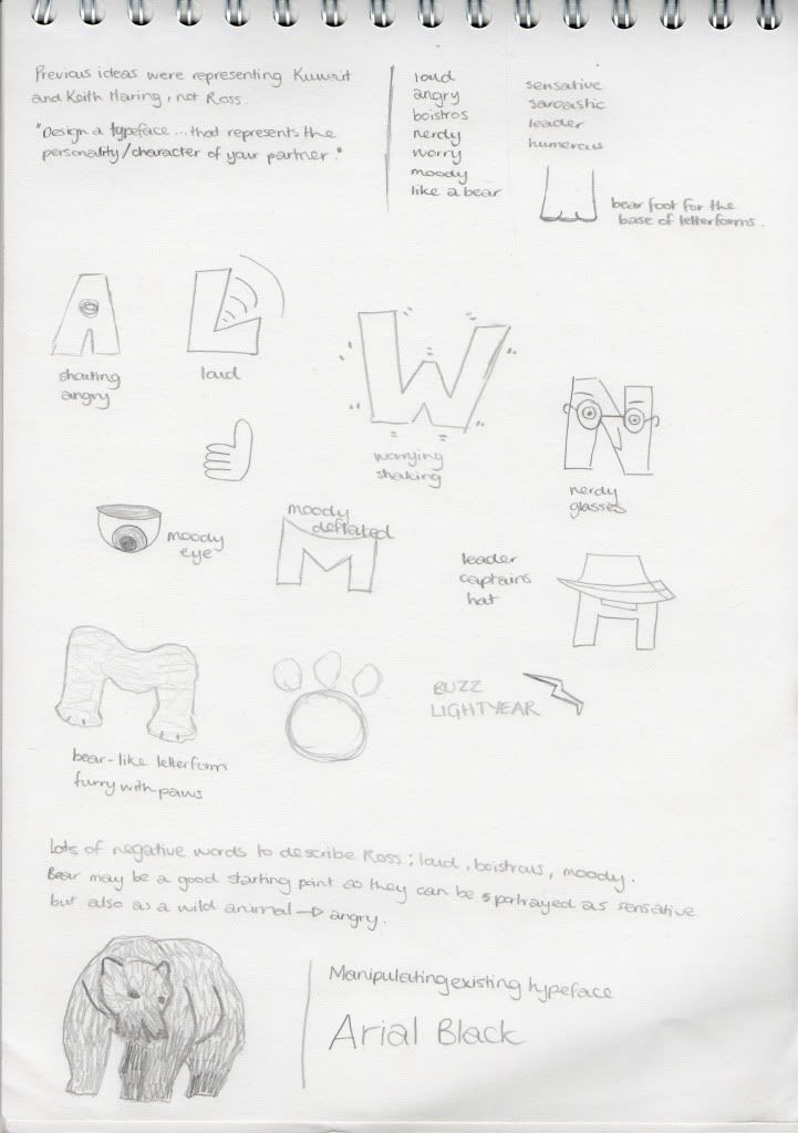
Today, I realised I was going down the wrong path with my idea. I was basing my designs on what Ross likes... not his personality/characteristics. I went back to the drawing-board and asked Ross to describe himself, I also asked a few mates around him how they would describe him and came up with loud, angry, boisterous, nerdy, worrier, moody, bear-like, sensitive, sarcastic, leader and humorous.


When I got home, I thought about what typeface I could use as my base. From the ones Ross suggested previously, I think Arial Black would work quite well as it is quite simple yet bold. I think this would be good to help me portray my partners character. I worked out what size I would need my original typeface to be to fit onto the A1 sheet (250points), printed them out and began to trace over them... manipulating as I went. I hoped to get a different idea for each letterform and then decide upon the best route.

Currently I like the designs I have done for G and H. I simply traced around the outside of the letterforms and only did small lines for the counters. I was attempting to make the letterforms appear bold and loud. I think with some colour to emphasise this, it could be a good choice to develop further.

FRIDAY 09.10.09
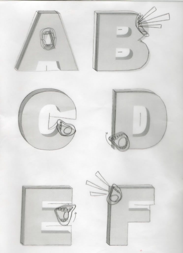
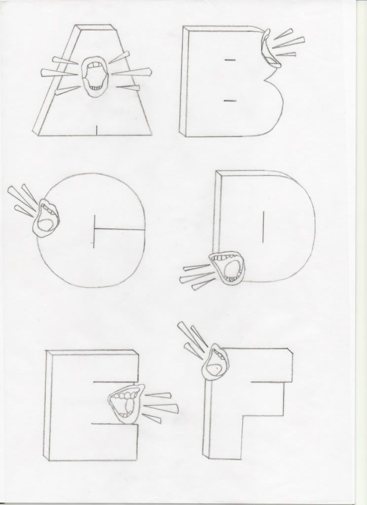
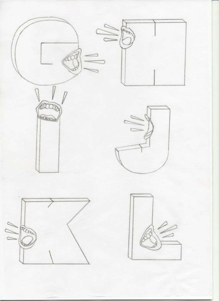
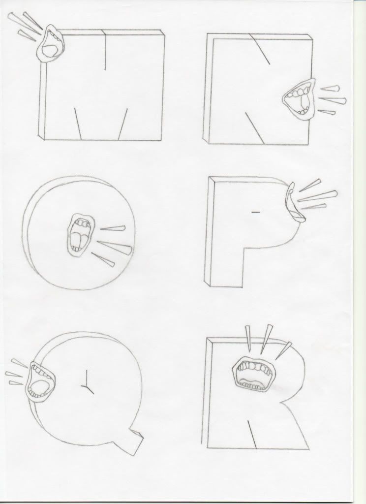
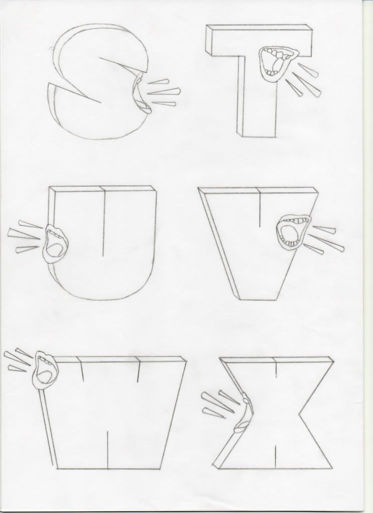
Over Thursday and Friday I developed my typeface further... thinking how I could make my design communicate better. The four words I had picked to use as a base were loud, boisterous, angry and leader. I thought the best way to represent all these was through a shouting mouth on the letterforms. I downloaded some pictures from Flickr and began tracing around the mouths. I then made the Arial Black letterforms 3D in Illustrator as I thought this would add to the feel of boisterous if they had more of a presence on the page.

In Illustrator I placed the outlined mouths over the 3D letterforms where I thought they would have the most impact. I printed this out and began to trace sections. I used the basic idea from G and H as before to create a bolder typeface, and used the mouths as an additional communicator. I also made suggestions of noise lines (as if a loud shout) and think this works quite well.

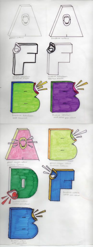
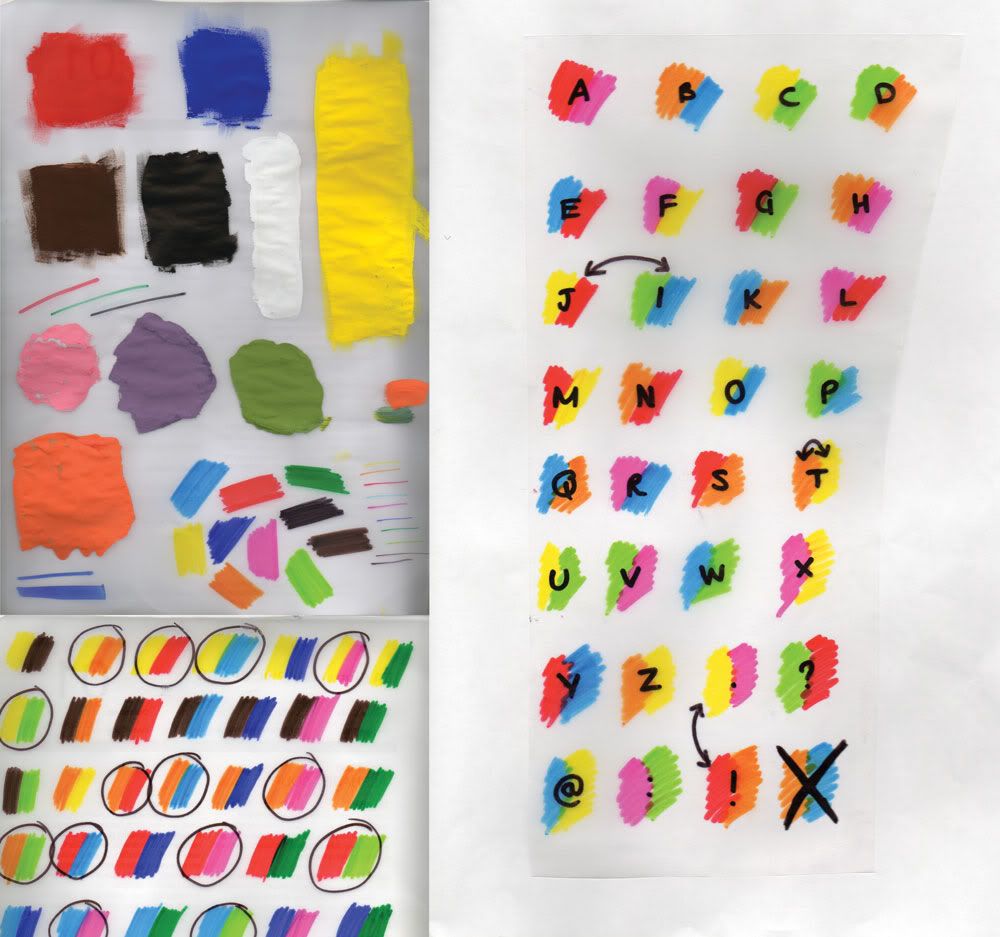
We had a Crit on Friday and I got some good suggestions about using colour. I messed about with different medias and the positioning of the colours on the letters to discover whichI liked and which worked the best.

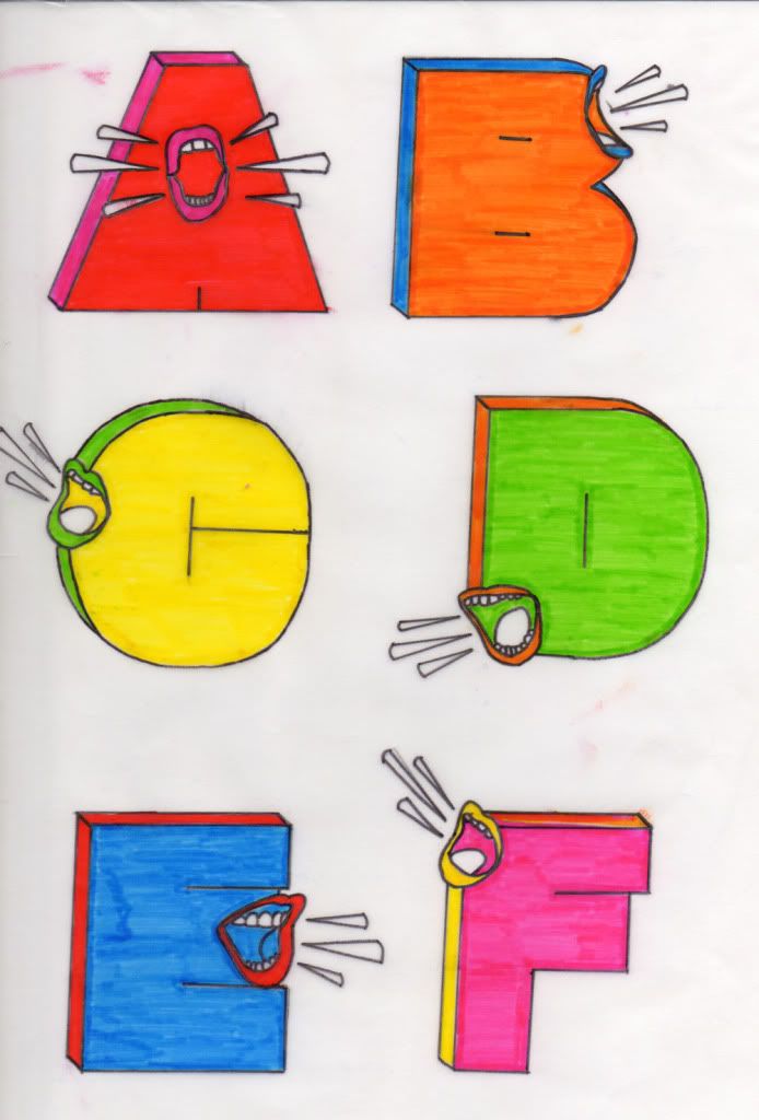
From this I decided to use 2 colours. One for the face of the letterform, and one for the sides. The teeth and tongue from the mouth would stay white/clear, as with the noise lines.

MONDAY 12.10.09
Today I finalised all my letterforms...


TUESDAY 13.10.09
Tuesday afternoon I decided upon the colours and media I would use. I experimented with gouache paints, marker pens, fineliners and felt-tips. I was looking for brightness to represent loud. I decided on felt-tip pens outlined with a black fineliner.

WEDNESDAY 14.10.09
Today I started drawing out my typeface on A1 tracing paper which I bought home from the College on Tuesday. I stuck together 8 sheets of A4 to create a white background for my tracing paper, then I sectioned it out so each letterform had the same spacing and also gave my piece a border so if I have time I can add another element to my piece. I placed my letterforms on the white base and laid over the tracing paper. I used masking tape to secure everything in place, this hopefully shouldn't rip any of the paper!

FRIDAY 16.10.09
We had a Crit with Fred and Amber today and it was so intense. The contributions that were made were really useful as there was so much constructive critisisms. I am going to work on my typeface some more over the weekend and make a few alterations which I will show the group on Monday.

Saturday, 3 October 2009

OUGD104 - A Visual Vocabulary (29.09.09)

On Tuesday I had to represent words with different fonts and sizes of the letter "A". The words we had to represent were systematic, project, loop, finish, connect, spine, negative, enclosed, right-angle and break.


We then all swapped places and had to figure out which image matched with which word, through this we would be able to know if we were representing the words effectively. The person looking at my images got 8 correct which I was happy with.

In groups of 3 we also had to represent one of our "Randomiser" words using every letter of the alphabet. My group chose my word of "Compress" and we cut out ll the letterforms and stuck them down overlapping each other, as though the alphabet itself was being compressed from above, below and both sides...


Before this, we also did a group task where we organised the letterforms we had collected over summer. We could group them by colour, size, style... etc. My group decided to only use the letter "A" and we made a huge A from the letterforms we had collected.