Monday, 28 February 2011

+3 -2

+3 YCN briefs
Ideally I want to produce typographic and print based designs.

Fedrigoni
Bring Fedrigoni’s versatile range of papers to life to ensure they’re the paper of choice for existing and new customers.
+ I would love to do this because of its obvious link to print rather than digital. 

Green & Black’s
Give new consumers a motivating reason to trade up to Green & Black’s.
+ This seems such an open brief but I especially like how they want to reate something as memorable as the Dove and Cadburys commercials seen recently. I think this could either go really well, or really badly.

SEGA
Create a piece of communication that celebrates the 20th Anniversary of Sonic.
+ Sonic is such an iconic figure, it would be really challenging and hopefully rewarding to create something to celebrate the 20th Anniversary.

-2 YCN briefs
I do not want to produce any material that will encourage young audiences to drink. I understand the advertising laws for alcohol and know that young generations will inevitably drink, however I do not have to be a part of the process. Drinking a Budweiser as I type. 

Tuborg
Develop ideas that will build the awareness and understanding of the Tuborg brand based on the theme, “Live Unleashed”.
- Alcohol affects people alternatively and I do not wish to be any part of the advertising/design of any alcoholic based companies. 

Whyte & Mackay
Create a compelling campaign that resonates, builds awareness and encourages trial of Glayva among a new younger audience.
- Again, especially when my designs would encourage younger audiences to try this beverage.

Wednesday, 16 February 2011

OUGD202

To see all Design Practice posts for OUGD202 please click the link below.

OUGD202 - DESIGN FOR SCREEN

OUGD202 self-evaluation

Design for screen was initially a challenge for me, however I now look at it as a massive step forward. I had never even contemplated using digital media to communicate my design ideas. I can see through the latest projects how important it is at capturing peoples attention and also, remembering them!

I found myself thinking more outside the frame and transitions between scenes. Focussing on the more basic elements of After Effects enabled me to build up my confidence in them and apply them correctly. It also made the whole process less stressful and easier to storyboard as I could easily visualise how something may look. Once I was creating in After Effects I would often elaborate on my original idea, which has resulted in a much more interesting animation.

My title sequence for Top Ten Tips: Typography is good as a piece of kinetic typography, but I am not sure how well it actually works for a title sequence. I seem to have forgotten about the research I did and went off and did somehting completely different. Saying this, I do still think it works with my final brief; as part of a series of top ten tips for designers, both studying and professional.

Changing my original idea from Top Ten Imaginary Friends definately was a good decision made early on. I became precious about one idea, without listening to crits or research. I decided to flush this down the toilet and start a-fresh. I initially thought 'worst typefaces' would be boring... but am very happy with my final animations as they don't look boring at all.

Strength wise, I have learnt After Effects and produced something unexpected. All aspects of the project relate to each other, from the simple packaging using the same stock demonstrated in my animation and the window showing the message, to the quote animated in the title sequence/ident. The idents and title sequence work really well together, but if I could change anything, I would make more of the initial title in my title sequence, it seems a bit weak and an after-thought compare to the rest of the 50 seconds. Also I should have done some more research into packaging, as I may have found a better solution or made my crafting skills more polished. Also I would have liked to design the DVD covering.

DO, NOT THINK needs to be my drive from now on. I found myself thinking about what I could do, instead of actually doing anything. It was only at the tutorial that I realise how little I had done. This was a turning point in this module and from then on was working 12 hour days! And... suprisingly, I didn't mind. I hope to continue this style of working for the rest of my practice.

Final packaging

I printed both the DVD case and poster on bulky newsprint. It relates the content with the packaging nicely by having the animation background used in this way. I was inspired by packaging I found by weeco and really liked the simplicity. The net with the window really communicates the process of looking through something, which is what typography should be about. It also enabled me to create a poster linked to my animation which was a big plus for me. I think it makes something that my audience can keep and act as a reminder of one of the tips in typography.

Tuesday, 15 February 2011

Final animations!

Title Sequence


On this version, some partys of the audio are louder. This has been corrected on the DVD submitted file.

Ident 1


Ident 2


Ident 3


Ident 4

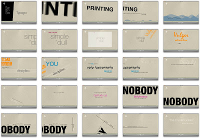
Keyframes

Support Work

Thats it Hazel, delete an asset the day before submission.

Yep. I am a tool.

I ran out of room on the uni computer so deleted a load of files... unfortuntely I didn't go through them well enough with a fine toothcomb and managed to delete my 'ugly tyography' Illustrator asset. Also I hadn't backed it up onto my external hard drive.

Monday, 14 February 2011

Top 10 Typography Tips

OK... so I have changed the title from Top Ten Terrible Typefaces to Top Ten Typography Tips. Obviously in the real; world I could not have done this! But unfortunately, it fits the work I have actually produced much better.

The short essay this quote comes from is all about the Crystal Goblet, which is the most effective typography. Typefaces are supposed to be transparent, and not detract from the message of the content.

This title also gives it a more educational slant, which was intended all along.

More detail...
More 4 have commissioned a educational series for designers focusing on the fundamentals. The series will run for 5 weeks and consists of a weekly episode documenting top tips for that week’s topic.

1. Typography
2. Image
3. Colour
4. Print
5. Digital

My title sequence and idents will be produced for the episode on typography. Also, each episode would start with a appropriate quote which would also relate to the top ten tips. The other epidodes would use a similar identity by keepiing Helvetica Neue as the font, but all other aspects would vary to support the topic.

Type specific episode...
Beatrice Warde explores serious typography as a magnificent metaphor titled “The Crystal Goblet”. An exquisite vintage of wine can be showcased in either a clear, thin and transparent glass, or one of solid gold, covered in pattern. The Crystal Goblet is the perfect typographic dream, to communicate to the reader without being acknowledged. By being inconspicuous, the reader can receive the message, without being distracted by ‘noise’ created from the typeface, “Type well used is invisible as type, just as the perfect talking voice is the unnoticed vehicle for the transmission of words, ideas.”. If we decipher her intricate story, we understand that the wine is the content and the glass is the typeface, for which is designed to be transparent and revel the contents, “the mental eye focuses through type and not upon it.”. She terms perfect type as ‘the transparent page’, meaning that the typography is not what the reader focusses on, but infact gets lost in the message. Those ‘popular’ excentric designers of our world will probably pass off ‘serious’ typography as a boring and meaningless task, which only matters to typographers themselves, however “there is nothing simple or dull in achieving the transparent page.”

Packaging experimentation

Skeleton

With poster and DVD

Inside

Poster. Front, folded

Poster. Back, folded

Poster. Front, half unfolded

Poster. Unfolded.

Digitised, with position annotations.

Saturday, 12 February 2011

Photographer?

Ah man. I have just realised in my audio, I say 'photographer' instead of 'typographer'. I am not sure if I will have time or an opportunity to change this. Great.

Vulgar colour

The scene for 'vulgar ostentation' needed a injection of colour... I much prefer the one all in orange as the multicoloured get accross vulgar, but it is no good if it cannot be read.


Thursday, 10 February 2011

Floundering

Colour pallet

Today I have refined my animation (so far) and have decided upon a more complimentary colour pallet, so no more garish reds!

Red, black or burgandy?


I orignially used red becasue it is often used to say 'NO'... but it just felt too harsh and uncomfortable against my background. The black is too dull and doesn't draw attention to anything... it sits alongside the 'simple and dull' and doesn't add anything to the character of the frame. The burgandy is a brilliant substitute. Steph O suggested it and I was sceptical at first but once applied, I think it looks great and a whole new world of a colour pallet has opened up to me which I think would work really well!

Personal final week reflection

This is how I feel about my work right now...

But while googling 'shit olympics 2012 logo I found this little piece of genius.

I think my animation is not really a title sequence... basically I am not fulfilling the brief. I need to stop moping about this and actually change the direction slightly so it bloody does! GET A GRIP GAGE!

Type 5

vhblrsj

vyukb


hvisn

precious

friendly

angry


In this lesson I looked at how to fit text to a given amount of space. By changing the leading, point size, typeface and paragraph features alot of space can be made.

Wednesday, 9 February 2011

Spin off or rotate off?

Animated 'vulgar ostentation' to show different bad typefaces... but i'm a little unsure of which transition to use to move from 'simple & dull'. I think I prefer the spinning off video (1st one) as this has more character and shows 'vulgar ostentation' to have more boisterous and uncaring approach.


Final Crit

My animation is still a working progress, apologies. Below is how far I have got rendered.

  • WHAT - Top 10 worst fonts
  • HOW - Kinetic typography - short metaphorical essay on good and bad typography
  • WHERE - More 4 - part of the 'Typography Season'
  • WHY - Educate  about good and bad fonts and why
  • WHO - Design/media students and people interested in typography or just a general interest in knowledge!


For the case I want to make something a bit more interesting and was thinking about ceating a lettershaped box to hold the DVD. I also want to include 1 of 4 possible posters (screenshots of idents)

Poster idea (will be portrait).

3D box... Too difficult in the time available!

Poster could fit in front panel... Brilliant!


Feedback....
Really good feeback and constructive. There are lots of little things I can take into account to make my work better and fit the brief more appropriately. I have underlined the points which I intend to work on!


Simple or dull

Animation has progressed alot... I still need to work out what transitions to use for 'floundering in self-conscious and maudlin experiments'. Also I will add paper effects to 'many'.


Simple or dull from Hazel Gage on Vimeo.

Tuesday, 8 February 2011

Humanity - kinetic

"Printing demands the humanity of mind,"

Not sure if the stamp effect of 'printing' works too well... would be coll if a little bit of ink splashed off the word to emphasise the power/force behind the print. I think it would look too over complicated to have 'humanity of mind' floating in and the heirarchy becomes affected. For this reasn I have simplified to animation down to grey with a opacity fade in.


Kinetic Typography 1

Woohoo! This is easier than I thought and here is the general basics of creating kinetic type in After Effects. Now I can edit the words individually but at least the are actually coming in at the right time now!

Wrong again!

Ok, so I started creating my animation without the audio. Lorraine told me to get my audi done now! So having just recorded it, here is the complete audio track! I now have to fit the words to this instead of the other way around.

Organisation

I have organised my layers in After Effects to make it easier for me to understand what layers happen when and what the content is...

IMAGE

Paper

After looking at some animations using paper I would really like to use these techniques as secondary bits of information in my work. Maybe for 'many' or hearts coming off 'fickleness' thing would work really well. Also I want to create the crystalline goblet and water from paper and have the background in paper.

PICTURES & VIDEOS

Tracing Paper


I thought this would look really nice, but there is not enough detail to establish itself as a background. I might as well just have it as a solid white layer.

Antique Paper


The paper needs to move with the text obviously but I like the colour and real quality the stock brings to the screen. I don't think the motion of how the 'norma' text comes onto screen (opactity), this needs addressing and to become more appropriate with printing on paper... maybe just appearing, instead of a fade.

Newsprint


Definitely the best material to use for my background!

Red Card


Orange Card

Yellow Card

Blue Card

Pink Card

Monday, 7 February 2011

Floundering

"...many of the fine arts are even now floundering in self conscious and maudlin experiments."

First attempt
VIDEO

Second attempt


Reflection
Again, I need to bring up the bottom text, and also this should move in a straight line, not up and down. The 'many' may need to change typeface or style to make it appear more different from the text and like a supporting bit of imagery. Instead of 'self consciousness' it should be ' self conscious' so this needs to change! Also I need to reconsider the typeface used to make it look more watery. The '&' needs dropping down too so that it sits within the frame, it looks uncomfortable overflowing the frame.

Keyframes